Latest Post | Last 10 Posts | Archives
Previous Post: Question of the day
Next Post: Blagojevich brother objects to fed proffer, and our quote of the day
Posted in:
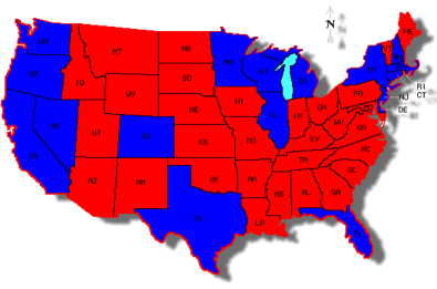
* This first graphic is a map of how states fare on their tax dollars. Those in red receive more than a dollar back for every tax dollar they send the federal government. Those in blue (including Illinois) receive less than a dollar…
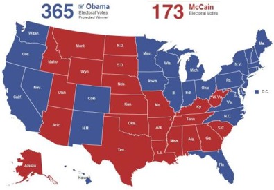
And this is the electoral map from the 2008 presidential election…
[Via]
Thoughts?
posted by Rich Miller
Monday, Apr 12, 10 @ 1:00 pm
Sorry, comments are closed at this time.
Previous Post: Question of the day
Next Post: Blagojevich brother objects to fed proffer, and our quote of the day
WordPress Mobile Edition available at alexking.org.
powered by WordPress.
Thoughts? Um, they look similar.
Comment by Obamarama Monday, Apr 12, 10 @ 1:06 pm
That’s as deep as you can go?
Comment by Rich Miller Monday, Apr 12, 10 @ 1:06 pm
As I’ve long-pointed out Rich.
Republicans whine about federal taxes, but Republican states pay far less in taxes than they receive in federal assistance.
The two biggest sources of discrepancy:
– Medicare & Medicaid, which Republicans loveto pillory;
– Defense, Republicans favorite object of discretionary and deficit spending.
Comment by Yellow Dog Democrat Monday, Apr 12, 10 @ 1:07 pm
A little post-lunch levity is all, Rich.
The bigger states have larger economies which contribute more than there share to the federal government–bigger pie means the same size slice, in relative terms, is also bigger. Pretty standard. As for the electoral map, the larger states tend to have larger urban populations which trend Democratic as opposed to rural populations.
Comment by Obamarama Monday, Apr 12, 10 @ 1:10 pm
appropriators named durbin, jackson, and lahood didn’t do their job in making sure we got our fair share.
less time playing politics and more time doing the job you are paid to do, dick and jesse.
Comment by shore Monday, Apr 12, 10 @ 1:10 pm
Unfortunately just about anyone can find statistical maps that take two sets of results and draw correlations because they look similar. However, Texas, Ohio, Pennsylvania, Virginia, and North Carolina are very large states that would appear don’t adhere to the implied correlation. I really dislike these kind of misleading visual representations.
Just out of curiousity, put the two results from 2000 or 2004 on the board and, while the states who are net federal tax givers may not change much, a different electoral map would lead to a different conclusion.
Comment by Budget Watcher Monday, Apr 12, 10 @ 1:27 pm
Obamarama,
I see where your’e going with the bigger state’s argument but how do you explain Texas and Pennsylvania? I’m not discounting your argument because it does have merit (lots of funding for rural development and the every state gets two Senator’s issue) but it doesn’t go all the way.
Comment by Ahoy Monday, Apr 12, 10 @ 1:30 pm
perhaps instead of calling them red states and blue states we should call them dependent states and donor states…
Comment by bored now Monday, Apr 12, 10 @ 1:30 pm
They’ll take my tax money, but then they want their senators to deny me health care? I see some big weaknesses to the federal system.
Comment by Joe Dokes Monday, Apr 12, 10 @ 1:45 pm
The reasons Texas is a donor state are:
1. No one retires to Texas, so they get less in Social Security and Medicare dollars;
2. Undocumented immigrants pay into social security and payroll taxes, but don’t get benefits;
3. There’s relatively little defense spending in Texas.
The reason Pennsylvania and Ohio receive more in taxes than it pays out is because they have much older populations.
Comment by Yellow Dog Democrat Monday, Apr 12, 10 @ 1:51 pm
No one retires to Texas? Huh?
Comment by Rich Miller Monday, Apr 12, 10 @ 1:56 pm
Although there are a few states with big economies that get more back (PA, Ohio, GA) for the most part the bigger states get less back. Probably enough here to support the theory that it is more than a random connection here.
I think maybe it also shows that states with smaller economies are in fact more reliant on government spending than they would like to believe. That includes all spending in various forms including for military contracting, bases, etc.
I wonder how that map would change if military contracting / spending is factored out.
Comment by siriusly Monday, Apr 12, 10 @ 1:56 pm
YDD - as much as I agree with you (80% I’ll say) - your post today is way simplistic. Go drink some Red Bull and try again.
Comment by siriusly Monday, Apr 12, 10 @ 1:57 pm
And in other news, statistics show a rise in shark attacks at the same time there’s a rise in ice cream sales on the beach.
Comment by C. J. Summers Monday, Apr 12, 10 @ 2:01 pm
Initially, my theory is this…. Republican states tend to be more rural. As it is nearly common knowledge that cities vote Dem. Similar to Raegan, it is my understanding that Republican Pres. G.W. Bush limited tax dollars going to the cities.
Therefore, I see it as two unrelated concepts that have less to do with Democratic voting and more to do with big city federal funding.
Comment by So IL Student Monday, Apr 12, 10 @ 2:11 pm
Republican voters have a tendency to vote against their economic interests?
Comment by Melancton Smith Monday, Apr 12, 10 @ 2:14 pm
===Initially, my theory is this…. Republican states tend to be more rural. As it is nearly common knowledge that cities vote Dem. Similar to Raegan, it is my understanding that Republican Pres. G.W. Bush limited tax dollars going to the cities.
===Therefore, I see it as two unrelated concepts that have less to do with Democratic voting and more to do with big city federal funding.
You might want to reread your argument here, the two concepts are very related if do.
Comment by ArchPundit Monday, Apr 12, 10 @ 2:15 pm
==You might want to reread your argument here, the two concepts are very related if do.==
Sorry, what I was saying is that with a Rep. in the Presidency pulling funding from cities does not necessarily mean pouring that funding into Republican areas (rural states). I should have been more clear.
Comment by So IL Student Monday, Apr 12, 10 @ 2:19 pm
These maps are just another form of “Keep Government Out of Medicare.”
What I mean is that there is a lot of ignorance about government finances and government programs — certainly a lot that was on display during the health care reform debate.
As a result we end up with the oxymoron that states that are the beneficiaries of government largesse are also states whose population supports supposedly anti-government spending politicians.
These maps also indicate that the best thing that can happen to the Democrats is if the GOP follows Newt Gingrich’s advice and tries to shut down spending. When federal spending stops, you’ll see a whole bunch of red state voters change sides.
Comment by the Other Anonymous Monday, Apr 12, 10 @ 2:20 pm
There is more value to the dollar in the red states, so they actually gave more. You can stretch a dollar farther in the red areas, so a dollar ain’t really a dollar. It is more like $1.50 or even two. And the dollar they got back from Uncle Sammy is much less than a dollar. So, you have to question the real numbers these graphs are based on. Graphs lie.
Comment by Sen. James Inhofer Monday, Apr 12, 10 @ 2:22 pm
Congrats, SJI, for perhaps the most incomprehensible comment ever posted here.
Comment by Rich Miller Monday, Apr 12, 10 @ 2:25 pm
It says that people in Michigan and Illinois are suckers.
Comment by VanillaMan Monday, Apr 12, 10 @ 2:35 pm
===#Sorry, what I was saying is that with a Rep. in the Presidency pulling funding from cities does not necessarily mean pouring that funding into Republican areas (rural states). I should have been more clear.
You made a pretty good points–I just thought your unrelated bit was kind of funny given what you said above.
But, essentially yes, rural states get more federal funding than they send. There are some exceptions–Pennsylvania and Ohio, maybe Texas to some extent.
There are several reasons for it, but highway funding works this way at the federal and the state level as well. If you have fewer people in an area and you are building roads, it costs more per person. And while you may spend a lot more in urban areas overall, divided by the number of people that spending is less per person.
Pennsylvania and Ohio are pretty good exceptions that prove the rule. They have older populations on average so direct payments are relatively high.
But even more simply put is that states with higher average incomes tend to pay more in taxes than they take in while states with lower average incomes tend to get more than they pay in. That happens to be tied to urbanization pretty well as wealth creation is largely done in large urban centers.
However, people who live in large urban centers to be more liberal (Texas has lots of small cities that counters this tendency) and so we get similar maps.
Comment by ArchPundit Monday, Apr 12, 10 @ 2:36 pm
Those maps are interesting. The states with the most surprising results are those with Senate leaders and/or heavy hitters: Nevada (Reid), Illinois (Durbin), New York (Schumer), California (Feinstein) and Florida (Nelson).
Some questions I have are as follows:
1. How can Michigan be in the blue when they have perhaps benefited more than any other state during the unemployment & COBRA extensions?
2. How can Florida be in the blue when Medicare along accounts one of their larger insurers and payers of medical and prescription costs?
3. Was the TARP money given to Delaware-based comanies NOT included in the tax dollar accrual?
4. California has received the most stimulus dollars and has one of the largest Medicaid and social service networks known to man. Are they really in the blue or did they perhaps fail to meet important federal matching dollar deadlines?
I have a lot of concerns about this map. Of course, any state with a military installation rakes in federal dollars - which are not matching and often times have few strings attached.
Comment by Team Sleep Monday, Apr 12, 10 @ 2:36 pm
Sorry, on point #2 my question should have read “when Medicare alone accounts for”…
Comment by Team Sleep Monday, Apr 12, 10 @ 2:37 pm
I’ll bet the first map, the net giver/receiver map hasn’t changed appreciably over the past 25 years. Yet, over the last 25 years, we’ve had Reagan, Bush Sr, Clinton, Bush Jr., and now Obama. The electoral map changes almost like clockwork.
If the two issues were correlated, I’d expect the first map to shadow the second.
Comment by Budget Watcher Monday, Apr 12, 10 @ 2:38 pm
Meh. Money changing states pay more than they receive.
Comment by Brennan Monday, Apr 12, 10 @ 2:40 pm
shore, when Denny Hastert was Speaker, do you think things were any different?
Illinois losing money through the federal government isn’t a new phenomenon. It goes back decades.
Comment by Carl Nyberg Monday, Apr 12, 10 @ 2:44 pm
=How can Michigan be in the blue when they have perhaps benefited more than any other state during the unemployment & COBRA extensions?=
The data is from 2005. You have to click through all the links to learn this.
Dang pageloaders!
Comment by Brennan Monday, Apr 12, 10 @ 2:48 pm
===I’ll bet the first map, the net giver/receiver map hasn’t changed appreciably over the past 25 years. Yet, over the last 25 years, we’ve had Reagan, Bush Sr, Clinton, Bush Jr., and now Obama. The electoral map changes almost like clockwork.
But the map doesn’t change that much electorally. The battle is fought at the margins with the same states up for play especially since 1992. So at least for 18 years it hasn’t changed much. During that time, the Republican Party has gained a solid South and Democrats have gained a solid Northeast and West Coast. The South, the Plains states, and the western mountain states are mostly small population and have economies based on agriculture which isn’t going to produce as much wealth and thus cannot be taxed as much.
Comment by ArchPundit Monday, Apr 12, 10 @ 2:48 pm
Like it or not folks, the Blue States are the rich states. That’s why they get back less. They’re subsidizing water in the Great Plains and deserts, retirees in the Sun Belt and roads connecting El Paso to Missoula.
YDD, Texas is a big defense state. They’re third in contracts and have Ft. Hood to boot.
Believe me, they won’t secede with that payroll.
Folks retire there, too, for the weather and the income tax situation.
The feds get more dollars from Texas because of energy taxes.
http://www.statemaster.com/graph/mil_def_con_exp-military-defense-contracts-expenditures
Comment by wordslinger63@gmail.com Monday, Apr 12, 10 @ 2:54 pm
A more accurate representation of this information would be to show tax dollars returned per 100,000 residents (by state). This would provide a better demonstration of where tax dollars are actually going as opposed to the attempt at statistical manipulation seen when using geography only (as opposed to the aforemention population stat).
Comment by InDupage Monday, Apr 12, 10 @ 2:54 pm
I can’t find a map, but here is the 25 year data.
Comment by Brennan Monday, Apr 12, 10 @ 2:56 pm
===how do you explain Texas and Pennsylvania?===
Two guesses. One, almost all of PA is “culturally rural” (poor farmers receiving ag subsidies and potentially other forms of support) with the exception of Philly. Even Pittsburgh feels more like Springpatch with a couple of towers. Also, their 20th century economy was based heavily on the steel and tool and dye industries which have been largely outsourced. This created more poverty and a larger demand for services.
Texas? Someone else is going to have to handle that one.
Comment by Obamarama Monday, Apr 12, 10 @ 3:00 pm
I think the first map has a much crisper and brighter tone than the second. Especially the reds. I also like the way the red highlight accentuates the blue around the edges. I especially like the way Lake Michigan is shown in the light blue compared to the dull, neutral tone of the second map.
Comment by Been There Monday, Apr 12, 10 @ 3:00 pm
We’ve been basically working with one US Senator since Obama came in office.
Comment by Just Wondering Monday, Apr 12, 10 @ 3:00 pm
===
A more accurate representation of this information would be to show tax dollars returned per 100,000 residents (by state). This would provide a better demonstration of where tax dollars are actually going as opposed to the attempt at statistical manipulation seen when using geography only (as opposed to the aforemention population stat).
This doesn’t change the map if one is only trying to figure out net gainers and net losers. Are you suggesting something else?
Comment by ArchPundit Monday, Apr 12, 10 @ 3:02 pm
What is included in the federal spending numbers? I went to the link and the link within the link, and I didn’t see the source of their numbers. Without those, it is impossible to draw any conclusions from the map.
Comment by Pelon Monday, Apr 12, 10 @ 3:03 pm
The source data is the Census Bureau.
Comment by Brennan Monday, Apr 12, 10 @ 3:04 pm
===But the map doesn’t change that much electorally. The battle is fought at the margins with the same states up for play especially since 1992. So at least for 18 years it hasn’t changed much. During that time, the Republican Party has gained a solid South and Democrats have gained a solid Northeast and West Coast.===
Clinton won the electoral vote twice with big margins, yet there was enough electoral variability that the next two elections swung to the Republicans. That tells me that while one map stays constant, the other map doesn’t. So at best, there’s limited or weak correlation. Yet, visually, the two maps look similar. To me, that’s misleading, and it’s this kind of faulty, simplistic analytic comparison that we see too often in the media.
Comment by Budget Watcher Monday, Apr 12, 10 @ 3:11 pm
===However, Texas, Ohio, Pennsylvania, Virginia, and North Carolina are very large states that would appear don’t adhere to the implied correlation.===
Most of them do, actually, if you look at electoral maps from the past few elections.
Comment by Rich Miller Monday, Apr 12, 10 @ 3:14 pm
Federal tax money, that is earned in Illinois, is sent to Washington, DC, and the federal government sends some money to the government of Illinois and the majority of county and city governments, in Illinois. Some tax money, that is sent, from Illinois to Washington, DC, is sent to many other state, county, and city governments, although many Illinois residents will never go to those places and benefit from that spending. The U.S. Constitution lists, in Article I, Section 8, all of Congress’ powers, and it doesn’t state that Congress may give money to state, county, or city governments. Therefore, that spending is unconstitutional.
This year, the U.S. government will spend about $3.6 trillion, including $652 billion (18% of the budget) to state and local governments. I hope that Congress will pass and that President Obama will sign a law that will eliminate that spending and will cut all federal income tax rates by 18%, since the federal government would need less money. After that happens, each state, county, and city government could change their tax rates, to ensure that they receive enough money. If you agree, please contact Senator Durbin, Senator Burris, and your representative, about my suggestion.
Comment by Conservative Veteran Monday, Apr 12, 10 @ 3:17 pm
@Conservative Veteran
Did I just read that or am I hallucinating?
Comment by Obamarama Monday, Apr 12, 10 @ 3:24 pm
You weren’t the one hallucinating, I’m afraid.
Comment by Rich Miller Monday, Apr 12, 10 @ 3:24 pm
=The U.S. Constitution lists, in Article I, Section 8, all of Congress’ powers, and it doesn’t state that Congress may give money to state, county, or city governments. Therefore, that spending is unconstitutional.=
Congress appropriates funds to the Department of Education. The DoE appropriates funds to Illinois, Chicago, Cook, DuPage, etc.
It’s constitutional. It may not be very efficient or effective, but it is constitutional.
Comment by Brennan Monday, Apr 12, 10 @ 3:33 pm
It amazes me that the media pretends like conservatives know anything when it comes to policy.
InDupage, the per capita angle doesn’t matter because you’d be dividing the money out and the money in by the same number.
It’s a wash. If you paid attention in junior high math class this would be obvious.
Comment by Carl Nyberg Monday, Apr 12, 10 @ 3:35 pm
It amazes me that the media pretends like conservatives know anything when it comes to policy.
What media have you been reading? I haven’t seen that kind of reporting since I was old enough to read.
Comment by VanillaMan Monday, Apr 12, 10 @ 3:40 pm
I doubt the students are paying attention in junior high math class when they deduce the per household deficit at $13,130 for this year alone.
I’ll bet the teachers are thrilled with double counting gambits as well.
Comment by Brennan Monday, Apr 12, 10 @ 3:40 pm
===If you agree, please contact Senator Durbin, Senator Burris, and your representative, about my suggestion.===
If you agree, please contact the Abominable Snowman, the Loch Ness Monster, and the Tooth Fairy at (202) 225-2331.
Comment by Obamarama Monday, Apr 12, 10 @ 3:42 pm
Bachmann’s now the Tooth Fairy? lol
Comment by Rich Miller Monday, Apr 12, 10 @ 3:49 pm
I was going to use Roskam but since I already told about 200 angry robocall recipients that his number is the one to call to get off “the list,” I figured she was as good a choice as any.
Comment by Obamarama Monday, Apr 12, 10 @ 3:54 pm
The Feds have really been more about political redistribution of wealth that “promoting the general welfare” and “providing for the common defense” for quite some time now.
I think if you really look at correlations between politics and which way “redistribution” flows, seniority and power of congressional groups for a state would probably be more important than for which party a state votes in Presidential elections.
Southern states tend to keep on re-electing incumbents forever (cases in point-Strom Thurmond and Robert Byrd). Southern states are more about bringing home the bacon than ideology, and senior left wing politicians seem be more national agenda and ideologically driven.
The more seniority a state has in Congress, the greater it’s ability to use that power extort Fed dollars by bottling up bills in committee if others don’t “play ball”.
The leftees seem to be more interested in increasing the size and power of the Federal government than financially benefitting their states.
It would be interesting seeing a map based upon a “power rating” of the states’ Congressional delegation, and whether that delegation is more Federal empowerment or state financial benefit driven.
e.g., Hastert was pretty much a figurehead as speaker, except of course when a Federal road grant would increase the value of his properties.
Meanwhile Senator Byrd of WVU, best known for bringing pork to his state, gets WV more than its fair share of Fed dollars.
Bottom line is that “revenue sharing”, filtering and redistributing resources by political clout from one state to another, should be minimized if not ended.
Wasn’t it Nixon who increased that to a major level? If so, that’s just another reason for me not to like the guy, along with creating the China problem and taking us off the Gold standard to expand deficit spending.
Comment by PalosParkBob Monday, Apr 12, 10 @ 4:07 pm
Well, for me it is rather obvious that in Texas, the folks in the Rio Grande valley pay more than the rest of the state - as much as the folks along the Gulf coast.
Comment by VanillaMan Monday, Apr 12, 10 @ 4:08 pm
lol…
Comment by bored now Monday, Apr 12, 10 @ 4:09 pm
Texas pays $1. They receive $.97.
Focusing on Texas doesn’t really explain the issue. Start with Illinois which sends $1 out, but takes back $.75.
Comment by Brennan Monday, Apr 12, 10 @ 4:10 pm
It would be interesting to go further and see a county by county breakdown - the urban areas would be more defined. There were some county by county breakdowns for the last two presidential elections going around after the elections, which highlighted the urban-rural breakdown red vs. blue areas. If your read history, this urban/rural difference in attitudes has been a problem since the first constitutional convention of the original colonies.
Comment by InParis Monday, Apr 12, 10 @ 4:59 pm
I’ll take a serious stab at the issue. Granted the matching isn’t one for one, but largely consistent as Rich’s post indicates.
As some other folks noted, there are agricultural subsidies that go to predominantly rural states. Those subsidies outweigh welfare benefits to urban poor in the US. But, rural areas and states are poorer than urban areas. States with higher urban population have a greater range of income than do predominantly rural states. [County comparisons are similar. I recall reading a few years ago that the poorest IL counties were in SO-IL. So, Cook, eg, which has high urban poor also has a professional and middle class that provide a higher average income and greater variety of incomes and professions, than do southern, rural counties in IL.]
Both parties consider the agricultural subsidies vital to their electoral success. Those subsidies are a sacred cow, even though many programs are grossly inefficient and there’s fraud, etc. The “general welfare” argument is, I suppose, that the people of the country must be fed. We must not let agriculture suffer. Agricultural incomes are the least predictable and suffer from variations in weather conditions each season. There’s a strong public policy argument for supporting them. The farmers don’t see themselves as welfare recipients. They work.
Yet, the rural states vote GOP because of cultural affinities, though the GOP is not perfectly pro-life or all that. Culture is important. This is the “What’s the Matter with Kansas?” thesis. The author thinks the rural people should vote Dem b/c of farm subsidies. He thinks KS GOP voters are idiots.
Comment by Peggy SO-IL Monday, Apr 12, 10 @ 5:08 pm
The northern border of Illinois is a little too far north on the first map… looks like it lopped off Platteville, Janesville and maybe even Racine or Kenosha.
Comment by Bookworm Monday, Apr 12, 10 @ 7:44 pm
If the current polls hold, the entire Electoral College map is going to be red in 2012.
Comment by Honest Abe Monday, Apr 12, 10 @ 8:19 pm
Rich…really. This is a specious as it gets. Let’s compare two maps, one regarding vote and one regarding taxes…then voila’ compare them as some vigorous analysis on party politics. Geez…how about putting up a map of indonesia color coded with cooking style and one of the U.S. with the same…then ask the question…”How do these compare?” Thoughts?
It would be about as apples to apples as your example…
Comment by Captain Illini Monday, Apr 12, 10 @ 10:41 pm
CI, unlike your example about cooking styles in different countries, voting and appropriations are actually, you know, connected.
Comment by Rich Miller Monday, Apr 12, 10 @ 11:14 pm
That confederate war thingy didn’t work out so well
Comment by Jack Monday, Apr 12, 10 @ 11:30 pm
For them or us? lol
Comment by Rich Miller Tuesday, Apr 13, 10 @ 2:06 am
Our rugged individualist friends in the South and West talk a good game, but they don’t have a problem taking money from the wealth-creating elites in the big metro areas of the Northeast, Midwest and West Coast.
It’s hard to overestimate the influence of the Senate in devising federal funding formulas across the board that favor smaller states.
Put it this way: more than half of the country’s population is in the ten biggest states, including Illinois. That means you have 80 senators from the other 40 scheming to pick our pockets every day.
Would the Reds be tax-eater states, in today’s vernacular? Somehow, I don’t think you’ll see that on Drudge or Fox.
Comment by wordslinger63 Tuesday, Apr 13, 10 @ 6:28 am