|
This flag might possibly be maybe, kinda, sorta starting to grow on me, but I could change my mind
Wednesday, Dec 11, 2024 - Posted by Rich Miller * Background is here if you need it. I’ve been thinking that the new state flag should be the Centennial Flag from 1918…  Clean, efficient, gorgeous. * But, as this post’s headline says, this one might be kinda starting to grow on me…  On the minus side, I can easily see why non-Illini fans would hate it because of that “I” - and it is pretty college-looking. But that “I” represents our state’s flagship university and would be recognizable. And there is no orange in it. Also, I think I would fly that flag on my porch and my pontoon boat. On the other hand, meh, I dunno. I just gotta say that this whole state flag commission thing is a complete letdown. Illinois has some of the best commercial and graphic artists in the world, but these ten choices are the best we can do? C’mon. * The opportunity to change a state flag doesn’t come around all that often. But the commission has given us some really lame choices. For instance… 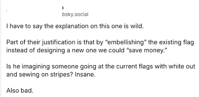 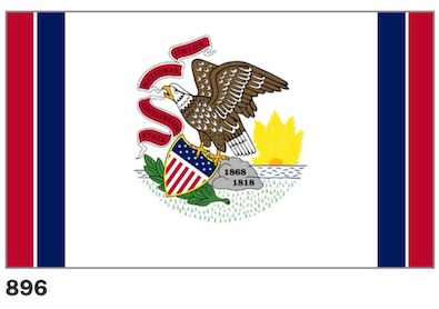 
|
 |
|
|








- Original Rambler - Wednesday, Dec 11, 24 @ 9:55 am:
Totally unimpressed by the ten finalists. If that’s the best then just keep the current one.
- StealYourFace - Wednesday, Dec 11, 24 @ 9:56 am:
It would be interesting if instead of an “I” it was the Mississippi River, kind of showing the western border of the state
- Stephanie Kollmann - Wednesday, Dec 11, 24 @ 9:57 am:
I’m glad someone else noticed how illogical the “save money” explanation for that flag (apparently submitted by a non-Illinoisian) is
- @misterjayem - Wednesday, Dec 11, 24 @ 9:57 am:
The Top 10 make a strong argument for keeping the current flag.
While I think that design of the current flag is very bad, I see no compelling reason to change to another bad design.
The devil you know etc etc.
An opportunity squandered.
Oh well.
– MrJM
- Homebody - Wednesday, Dec 11, 24 @ 9:59 am:
Centennial Flag with one minor alteration (big star be six pointed) would be my hands down favorite, but I’ll take it as is.
I am very much apposed to anything with words, letters (including the negative space I), Lincoln profiles, state shapes, or just reproducing the seal.
Other than the negative space I, I also don’t like flags that appear too heavily to borrow existing motifs from the US flag. Looks like some sort of flag from an alternative history show or a Bioshock game or something.
So after all of this, give me the Centennial, one of the other three blue/white/gray stars and stripey ones, or the blue and orange monarch one.
- Stephanie Kollmann - Wednesday, Dec 11, 24 @ 9:59 am:
If we were the only “I” state, I’d understand the design. But we aren’t, so … ????
- I-55 Fanatic - Wednesday, Dec 11, 24 @ 10:00 am:
Not only are most of these flags very unimaginative, but I can’t get over the inefficiency of how the Commission used up these 10 very coveted spots. Two flags that have Lincoln’s profile? Three flags that feature the outline of the state? They should’ve been more bold. Also, I’m fairly shocked that zero of these finalists feature Native American heritage or history in any way. At least one of those 5,000 submissions must have featured a Piasa bird or Cahokia in a compelling way.
- Lurker - Wednesday, Dec 11, 24 @ 10:00 am:
How 896 made it to the finals, especially with that reasoning, was shocking to me when I reviewed these yesterday. Simply terrible and makes an overly complicated flag worse.
As for your Centennial Flag comments, I agree. I like it as much as any of the finalist flags.
Lastly, I do not have that Illini flag in my top 3 but meh, I don’t hate it and it is much, much better than the current monstrosity… I mean, flag.
- RPOne - Wednesday, Dec 11, 24 @ 10:02 am:
I actually love entry 2246
- Benjamin - Wednesday, Dec 11, 24 @ 10:10 am:
@misterjayem: I have to differ. Illinois’ current flag is so deficient in design that most of the proposed designs are a marked improvement. Even 896 improves over the current flag by eliminating the word ILLINOIS (writing on a flag is generally a no-no).
- Northsider - Wednesday, Dec 11, 24 @ 10:18 am:
These 10 finalists? Blech.
They’re uniformly terrible, fit only for an internet rabbit hole for a future TED talk about awful flags. Even the centennial flag (which looks like a rocket ship) says nothing, represents nothing about Illinois.
The process should be begun anew and the commissioners who picked these should be replaced and kept at least 10 miles from the do-over.
- meh - Wednesday, Dec 11, 24 @ 10:21 am:
Yeah, these are all pretty uninspiring. I wonder if the submissions were all kind of blah or if the commission just tried to pick the most boring choices
- I-55 Fanatic - Wednesday, Dec 11, 24 @ 10:22 am:
I also really can’t get over the justification for 896. The cost of changing a state flag has nothing to do with how extensive the design changes are. Are they imagining someone going up to each current state flag with duct tape and white out?
- old guy - Wednesday, Dec 11, 24 @ 10:24 am:
I find finalist #3 most creative and interesting b/c of the Land of Lincoln, the westward expansion, the Mississippi River, and the general variance from other flags.
- Phineas - Wednesday, Dec 11, 24 @ 10:24 am:
From the ten, I’d pick 4220 - the one with the Lincoln silhouette and the Mississippi border. I thought it was a clever discovery of the similarity — and would look very different from most other state flags
- Name Withheld - Wednesday, Dec 11, 24 @ 10:27 am:
I really like the flag with the Lincoln profile bordering the western border of Illinois, with the white space suggestive of the Mississippi river. Very nice and clean design
- Center Drift - Wednesday, Dec 11, 24 @ 10:30 am:
Keep the current flag but please change the license plates.
- James - Wednesday, Dec 11, 24 @ 10:30 am:
I really like the 4220 flag. The Lincoln silhouette is great set against the outline of the state. I see several comments on here that are borderline “Lincoln bashing” and I just will never understand that.
- Jack Sinatra - Wednesday, Dec 11, 24 @ 10:34 am:
I think it would be great if the Commission released all the flag designs submitted on its website. It’s a nice tip of the hat to all the people (especially the kids) who submitted flags.
- Sangamo Girl - Wednesday, Dec 11, 24 @ 10:46 am:
When you ask for free design services, you get what you pay for. Some of these might be great ideas, but none of them, except maybe the centennial flag, are ready for prime time.
- OneMan - Wednesday, Dec 11, 24 @ 10:53 am:
The whole list was sort of ‘meh to me.
I don’t get the fascination with stars; flags don’t have to have stars; is there a star lobby or something? Also, being the 21st state seems to be a way bigger deal in flags than I expected.
4321
Please spare me the U of I orange. Also, a butterfly is not a symbol of strength.
4220
The negative space, not really being anything, is visually distracting. Also, the state isn’t flat to the East. If you put the shape of the state in a flag, it needs to be the whole state.
4221
The blue on blue? Meh’
3754
Meh
3679
I have to say that this would be a contender if the white star were just a white or gold star the same size as the others. It ‘representing Chicago’ is a deal killer. I love Chicago, I work in Chicago, but it shouldn’t be emphasized over the smallest village in the state.
2752
I’d be ok with this one, but again, the stars….
2246
I wish I had a better way of putting ‘It looks too 70s to me,’ but I don’t
896
Meh
200
Stars
Sesquicentennaial Flag
This would be my second choice if the state didn’t look distorted.
- NIU Grad - Wednesday, Dec 11, 24 @ 10:55 am:
Definitely a missed opportunity and I’m very disappointed in the commission. Did they leave it up completely to submissions? Did they not do any outreach to guarantee that some experts would submit their proposals?
Remember when Cook County teamed up submitters with a graphic designer to refine their proposals? That clearly did not happen here. All of these proposals are so close to “final” but are stuck looking like clip-art. Can you imagine any of these on your flagpole or at an official event?
At this point, we might as well just stick with the current one until a future commission gets it right.
- SammyG - Wednesday, Dec 11, 24 @ 11:04 am:
I think most of them are a vast improvement. At least people will know it’s Illinois, and not a random county flag.
The butterfly is a much better nod to UofI, as well.
- Mister Ed - Wednesday, Dec 11, 24 @ 11:05 am:
Not impressed with any of them really. They look like Texas flags at first. Not wild about the star thing going on with some of them. What’s wrong with the current flag?
- NewToSpringfield - Wednesday, Dec 11, 24 @ 11:26 am:
Hypothetically, could someone FOIA the flag commission to see all the submissions? I’m curious if the submissions were bad or if the flag commission did a bad job picking finalists.
- ChrisB - Wednesday, Dec 11, 24 @ 11:37 am:
I was unimpressed with the lot, but I’m also not a fan of the current minimalist trend in vexology. The current flag is too busy, but it’s also unique. Can’t say that any of the top 10 stand out from the others. Maybe 4129, with the intersection of agriculture and industry, but blue on blue makes it blah.
And for as cool as the six sided star is, I think anything “Chicago” in the flag would get an immediate no from downstate for…reasons.
- Pot calling kettle - Wednesday, Dec 11, 24 @ 11:39 am:
I looked at these with my adult children (both are in the design field) and they and I were disappointed by the final 10; especially the inclusion of a seal-on-a-bedsheet flag. My favorite comment was regarding the explanation for 3754 “The central circle abstractly represents the view from above Abraham Lincoln’s hat.” Which reminded my daughter of design critiques where a student would make up something on the fly when asked about some abstract element.
If there were another round, I think both would submit entries (they were busy with college and campaigning this fall). Perhaps putting up the finalists was meant to inspire a future round of submissions from those who didn’t submit anything the first time around. (”Hey, this is all we got; you got something better?”)
- Blazzzer - Wednesday, Dec 11, 24 @ 11:48 am:
Where can we see all 5K submissions? Is that something that can be FOIA’d?
- Leap Day William - Wednesday, Dec 11, 24 @ 11:51 am:
== I actually love entry 2246 ==
This one has grown on me quite a bit as well. Seems to be the only one that really represents all of the state the best to me. I agree with whoever said it feels like the 70s but they can’t explain why, however I’m not holding that against the flag. If I had to vote today, it would be this one.
4669 looks like something I’d see at an Illini tailgate. I already hate the I-shield logo that athletics rolled out several years ago, and would hate it even more in the state flag
4321 feels like a rejected Mississippi state flag design repurposed for Illinois.
I liked 4220 at first, but it looks like it could be the logo for some alternate universe sport like the NBA and MLB logos.
4129 I could live with, but it’s boring and just feels like another generic shape in the middle with stripes coming out of it.
At best, 3754 reminds me of the Flag of Greendale Community College; at worst, it evokes some real deep internet lore that does not belong in public.
3679 and 2752 are equally meh for the same reasons, but I’d take the former over the latter.
896 is a non-starter and does not address the “Seal on Bedsheet” complaint at all.
200 feels like a DPRK homage.
- JoanP - Wednesday, Dec 11, 24 @ 12:02 pm:
= At least people will know it’s Illinois, =
No, they won’t. A butterfly does not say “Illinois”. That thing that looks like a lotus, but isn’t, doesn’t say “Illinois”. A big “I” could mean Indiana, or Idaho, or Iowa.
I didn’t even realize 4220 had Lincoln’s profile and the western border of the state until I squinted. A gold star doesn’t say “Illinois” and neither do green and white stripes.
The only ones recognizable as an Illinois flag are the two with the full state image, and even those aren’t well-designed.
Back to the drawing board, people. And ask some professionals.
- NewToSpringfield - Wednesday, Dec 11, 24 @ 12:10 pm:
==The only ones recognizable as an Illinois flag are the two with the full state image, and even those aren’t well-designed.==
A good design becomes iconic and associated with the state. Nothing about the Texas flag says “Texas,” but it’s an iconic flag, so everybody knows it. Same with Arizona, same with the Chicago flag… Make a great design that is *symbolically* associated with Illinois and it’ll become iconic, but it doesn’t have to have something that obviously ties it to the state, in my opinion.
- Give Us Barabbas - Wednesday, Dec 11, 24 @ 12:22 pm:
Hate them all; too corporate logo-looking, like they used an A.I. to generate. I think the seal could be abstracted to fill the rectangle better. Incorporating Lincoln is too on-the-nose. The state shape is awkward to fit into a rectangle. This exercise reminds me how awful the license plate design process was.
The entries are too abstract or too literal and there’s not much in between. Staying with the retro seal is better, just scale it to fill more of the rectangle.
- Scott Main - Wednesday, Dec 11, 24 @ 1:48 pm:
If these are the 10 we have to choose from, I’m all in on 2246.
For those pushing 4220, I see a vase.
- Original Rambler - Wednesday, Dec 11, 24 @ 2:56 pm:
If I had to choose one of these it is 3679.