Latest Post | Last 10 Posts | Archives
Previous Post: Report: “Twenty years from now, most of the Illinois Basin coal industry will be gone”
Next Post: Question of the day: Golden Horseshoe Awards
Posted in:
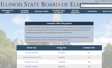
* I wanted to do a bit of research for a story I’m working on this afternoon, so I clicked on the bookmark and surfed to the main candidate filing page on the Illinois State Board of Elections’ website. Alas, the dreaded “overlay” appeared. If you’ve ever had to deal with that website you know what I’m talking about. Here’s what the page is supposed to look like…

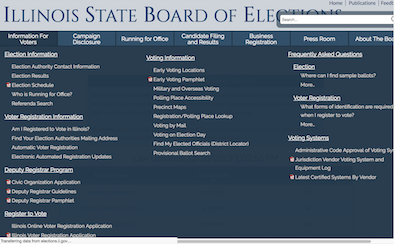
But here’s what you see when the overlay mysteriously deploys itself…

* You cannot make this overlay go away. You can click on the page or try to scroll down, but the overlay prevails. It has to disappear on its own, or you accidentally click on another link and then have to start all over again.
Here’s what the page says in the bottom left-hand corner while the overlay is visible…

I decided to wait it out today and activated a timer. After two minutes and ten seconds I accidentally clicked another link while trying to make the overlay go away and my experiment ended.
This doesn’t happen every time, but it happens often enough that it DRIVES ME NUTS.
/rant
posted by Rich Miller
Tuesday, Dec 10, 19 @ 1:21 pm
Sorry, comments are closed at this time.
Previous Post: Report: “Twenty years from now, most of the Illinois Basin coal industry will be gone”
Next Post: Question of the day: Golden Horseshoe Awards
WordPress Mobile Edition available at alexking.org.
powered by WordPress.
Literally the worst web-site.
Comment by Ok Tuesday, Dec 10, 19 @ 1:24 pm
Just look at those screenshots.
There is almost nothing of value on the front page. The thing with the most prominent position is a site search box that is meaningless.
Then, they stick an entire file folder of contents in a menu, with the most important or most-used functions hidden in a list of 100 other things that are irrelevant for 99.9999% of the population of the state.
Comment by Ok Tuesday, Dec 10, 19 @ 1:28 pm
If i don’t know better, it’s as though they’re trying to make it difficult.
I kid… I KID…
Comment by Oswego Willy Tuesday, Dec 10, 19 @ 1:30 pm
It’s all about where you leave your mouse and for how long. That overlay appears when you leave your mouse on one of those top menu bar items (e.g. “Information for Voters”) for a bit. but if you move your mouse back to the top main heading, the overlay goes away. At least it did for me using Chrome. If you want to get to the bottom portion of that page, you have to move your mouse quickly and not stay too long on any of the hot spots below the heading too long.
I agree, it’s not a user friendly design at all.
Comment by Occasional Quipper Tuesday, Dec 10, 19 @ 1:32 pm
Rich, I would have thought by now you would have learned they have a poor website design on purpose, and complaining about it gives them joy. The powers that be don’t want you to look up how much money they’re raking in.
Comment by Just Me 2 Tuesday, Dec 10, 19 @ 1:32 pm
I don’t experience that.
Whenever the overlay shows up I move the cursor up or down and it goes away. Perhaps it’s browser related.
Comment by MikeMacD Tuesday, Dec 10, 19 @ 1:33 pm
It’s as if the Sun-Times web developer from 2014 took over the Board of Elections.
Comment by unspun Tuesday, Dec 10, 19 @ 1:38 pm
Maybe the IT tech is Mr. Madigan.
Comment by Rudy's teeth Tuesday, Dec 10, 19 @ 1:39 pm
Overlay goes away after moving the mouse. Could this be a browser issue? Using Firefox 71.0.
Comment by Anyone Remember Tuesday, Dec 10, 19 @ 1:43 pm
I’m with MikeMacD. I tested it using Chrome, Edge, and Internet Explorer. When I hover over the top menu (while using a desktop browser), then the overlay appears. But as soon as I move my cursor outside of the overlay area, it disappears. Now, this is a real workaround if you absolutely hate using the site with a desktop browser, but if you’re using Chrome, you can hit the F12 key to open Developer Tools and preview/browse the site through the lens of a mobile device. You can select from a variety of tablet or phone layouts and that has a significant effect on the page in terms of user experience. The overlay appear on hover changes to an overlay appear on click. You must also click/tap outside of the overlay within the mobile layout to make it disappear again. Just a couple of cents. Good luck using the site!
Comment by Chambanalyst Tuesday, Dec 10, 19 @ 1:44 pm
It’s awful. And their whole redesigned website is awful. Don’t think they did the user testing they were planning to. It just sucks. Can I say sucks?
Comment by Chicago Cynic Tuesday, Dec 10, 19 @ 1:44 pm
Try this: Right click on the page itself. Click “inspect element”. From this page you can “temporarily edit” whatever webpage you are using. You can remove frames or content from the website. This is especially helpful when dealing with ghost clicks or window overlays (paywalls). You can also click “Ctrl+Shift+C” to enter the menu and click on items you want to clear.
Remember: This is only temporary. As soon as you refresh, or navigate to another page, your edits will be reset.
Comment by The State's IT Guy Tuesday, Dec 10, 19 @ 1:45 pm
mover the cursor up or down. I hate this new layout.
Comment by ETown60120 Tuesday, Dec 10, 19 @ 1:46 pm
=== but if you move your mouse back to the top main heading, the overlay goes away===
Nope.
And why should I have to move my mouse even if that did work, which it doesn’t?
Comment by Rich Miller Tuesday, Dec 10, 19 @ 1:48 pm
Blame the Russians…
Comment by Billy Sunday Tuesday, Dec 10, 19 @ 1:54 pm
The ISBE website is awful. All that fanfare about a redesign and what’s better about it?
For that matter, the www.illinois.gov website isn’t very good either. It was poorly redesigned in the Rauner years, but that’s par for the course with that administration and IT related issues.
On the main page, if you scroll down it’s just a random collection of boxes with press releases.
If you click the Government icon on the main page, you’ll see another random collection of boxes under “Services” - with no obvious organizational logic.
The State of Illinois Data Portal (data.illinois.gov), which could in theory be useful for the public and media alike, is also just a sad collection of boxes with random spreadsheets tossed into them.
Yesterday we had a post about “innovation jobs” as being key for economic growth and yet we have state websites that look like they were picked up at Kmart liquidation sales.
Surprisingly, the City of Chicago’s website is not bad, and it has a credible data portal, data.cityofchicago.org.
Comment by Moe Berg Tuesday, Dec 10, 19 @ 1:54 pm
Let’s not forget that this website was brought to you by Sandvoss and the brilliant team that beat the Russians. /s
Comment by Duckhunt Tuesday, Dec 10, 19 @ 2:08 pm
I saw that they’re hiring a new general counsel. Wonder how long it’ll take them to hire a web designer/professional IT
Comment by Madigoon Tuesday, Dec 10, 19 @ 2:10 pm
Dialing in by modem to AOL and using Netscape Navigator, I don’t have any problems with this overlay.
Comment by Michelle Flaherty Tuesday, Dec 10, 19 @ 2:13 pm
==And why should I have to move my mouse even if that did work, which it doesn’t?==
Because they moved the cheese, dude. lol
Comment by A Guy Tuesday, Dec 10, 19 @ 2:18 pm
You’re required to data mine the website for any information. I needed step-by-step instructions from SBE staff on how to check recent objection filings on the website. Too many steps and so many clicks. You will lose years of your life trying to find information posted on that website.
Comment by Frequent Filer Tuesday, Dec 10, 19 @ 2:23 pm
I have my resolution set to 1920*1080. The overlay for Campaign Disclosure still takes up the whole screen. When I bumped my resolution down to 1600*900, it was necessary to scroll down to see everything on the overlay.
Comment by Timmeh Tuesday, Dec 10, 19 @ 3:00 pm
It is the worst, but I think this could lead to a broader conversation about how all of the Illinois state agency websites are also very, very bad.
If they aren’t horribly over-featured like the Board site, they’re boring and also somehow equally impossible to navigate.
Please, State of Illinois, there has to be something we can do.
Comment by BilboSwaggins Tuesday, Dec 10, 19 @ 3:13 pm
If the State would stop making websites look pretty while destroying user-friendly functioanlity, that’d be great. But they keep doing things like this (IDFPR springs to mind with some of their design elements, or the so called “transparency and accountability portal” which was made HARDER to get to State employee data).
Comment by revvedup Tuesday, Dec 10, 19 @ 4:20 pm
Looks fine in the latest Chrome. No issues.
If you’re using Internet Explorer — that’s the real problem.
Chrome and Firefox and the latest Edge are fine.
Comment by Mr. K. Tuesday, Dec 10, 19 @ 6:14 pm
BTW,
Rich — you should review your ‘Live’ (twitter, etc) column in the latest Chrome.
Half is cut off. Actually, looks awful. I’m happy to send screenshot if you want it.
Comment by Mr. K. Tuesday, Dec 10, 19 @ 6:16 pm