Latest Post | Last 10 Posts | Archives
Previous Post: IMA chief responds to Pritzker comments on lagging employment growth
Next Post: Drilling down
Posted in:
* From Gov. Pritzker’s Q and A yesterday…
* Q: The new potential state flags have been unveiled. Do you have an opinion on the top 10 designs, and do you believe that Illinois would be better served by a new banner?
* Pritzker: I really like our current flag. I also like the designs that were put forward. Don’t want to sound too political about that, but I mean, I think a lot of effort was put in that. I saw a report that showed 10 flags, but they forgot that there’s also the centennial flag. There’s also, you know, the original flag. Those will be considered, I think, in the voting that’ll take place by the public. So, you know, I don’t have a preference about any single one of those. I am glad, though, that we’re at least considering all the options here, and what we end up with will be a choice that the public makes.
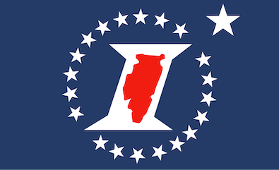
* The Sesquicentennial Flag is also in the mix…

posted by Rich Miller
Friday, Dec 13, 24 @ 11:56 am
Sorry, comments are closed at this time.
Previous Post: IMA chief responds to Pritzker comments on lagging employment growth
Next Post: Drilling down
WordPress Mobile Edition available at alexking.org.
powered by WordPress.
I didn’t know if designing an appealing Illinois flag is impossibly difficult, but this contest has certainly made it appear so.
(That said, the centennial flag is by far the best of the bunch.)
– MrJM
Comment by @misterjayem Friday, Dec 13, 24 @ 12:00 pm
Italicizing a state’s outline is something you don’t typically see…anywhere, ever. (HT to my daughter and her friends.)
Comment by Pot calling kettle Friday, Dec 13, 24 @ 12:03 pm
I wish the process was more open and transparent, and that there could have been two rounds of voting, the 10 flags presented are ok, but I would have liked to see more options.
Comment by Cheesy Beef with Peppers Friday, Dec 13, 24 @ 12:22 pm
The public input vote on flag designs would be a great opportunity to try approval voting. Or ranked choice/instant runoff.
Comment by thechampaignlife Friday, Dec 13, 24 @ 12:26 pm
Most of the entries look like cheap signs you’d find in a strip shopping mall. What’s the matter with the existing flag? At least it looks dignified. The rest are crap.
Comment by Joe Schmoe Friday, Dec 13, 24 @ 12:34 pm
i like the flag above much better than any of the others I have seen. Much better.
Comment by JS Mill Friday, Dec 13, 24 @ 12:34 pm
=: I really like our current flag. I also like the designs that were put forward
This is a classic example of condemning with faint praise
Comment by Donnie Elgin Friday, Dec 13, 24 @ 12:45 pm
JB did a fine job of walking the line on this topic between importance and completely irrelevant.
I know my view is in the extreme minority, but I’d prefer no attention on it at all. It’s fine we have a flag, it’s an artifact of another time when those things were more relevant and it doesn’t do any harm that it still exists. There’s no overt racism on it from 200 years ago or anything like that.
Let it continue to exist and be used wherever it has to be used, but also let those places where it is used continue to shrink down until that number is zero.
It’s the wall-mounted landline phone in the basement, of government. It still exists and it isn’t doing any harm, but focusing any efforts on its continued existence also isn’t very useful for the future.
To each their own. It won’t affect me either way if the flag is changed or unchanged. Just like that land-line phone.
Comment by TheInvisibleMan Friday, Dec 13, 24 @ 12:48 pm
==What’s the matter with the existing flag?==
It’s boring and soulless. Imo.
Comment by Alton Sinkhole Friday, Dec 13, 24 @ 1:05 pm
A good standard is “would you get a tattoo of this?” Look how many people are inked with Chicago flags. We should come up with something as simple and recognizable. These submissions ain’t it.
Comment by Barnaby Wilde Friday, Dec 13, 24 @ 1:08 pm
The current flag is indistinguishable from most county flags, both in and out of Illinois.
Why didn’t they include the bicentennial flag, it’s so much better than the sesquicentennial flag.
https://www.wsiu.org/history/2017-12-04/carbondale-raises-illinois-bicentennial-flag
Comment by SammyG Friday, Dec 13, 24 @ 2:33 pm
We have discussed this a lot. I will only add to my comments, that I am not a fan of “red, white, and blue.” Co-opting our Nation’s flag doesn’t speak to a Republic of States. We should be Illinois, not “Illinois (cf. USA).
Comment by H-W Friday, Dec 13, 24 @ 3:13 pm
=== What’s the matter with the existing flag?
Well, Googling “what makes a good flag design” comes up with these principles:
- Keep It Simple. The flag should be so simple that a child can draw it from memory.
- Use Meaningful Symbolism. The flag’s images, colors, or patterns should relate to what it symbolizes.
- Use 2 or 3 Basic Colors.
- No Lettering or Seals.
- Be Distinctive or Be Related.
The current flag fails items 1 and 4 and I’d argue it doesn’t pass item 3 either. As far as item 5 (be distinctive), I doubt most American’s would recognize it as a state flag at all if it didn’t say “Illinois” on it.
I don’t have a clear front runner, but I think people are missing a pretty good flag in 4220.
https://www.ilsos.gov/special/IFC/10finalists.pdf
Comment by scurvydog Friday, Dec 13, 24 @ 3:42 pm