Latest Post | Last 10 Posts | Archives
Previous Post: SUBSCRIBERS ONLY - Supplement to today’s edition and a Statehouse roundup
Next Post: Cullerton all but promises a floor vote for concealed carry
Posted in:
* From Data Pointed via Sully we have population change in visual format…
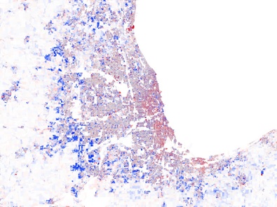
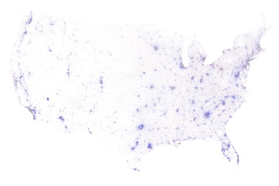
(C)olor-coded by the change in population density from 2000 to 2010. In urban areas, deep blue indicates that the population doubled (or more), pure red means that everyone left, grey denotes no change, and the intermediate tones represent the spectrum of increases and decreases in-between. Below 5000 residents per square mile, these colors fade with the square root of density towards white, where no people lived in either year. We created these maps from the official U.S. Census 2000 and 2010 block-level population data and boundaries using custom-built cartographic software.
Here’s Chicago metro. Click the pic for a larger image…
Full USA…
* Speaking of population shifts…
The trend of immigrants heading directly to American suburbs instead of starting in a major city intensified from 2000 to 2010 – and was one factor in Illinois’ 32.5 percent increase in Hispanic population in that period, according to recently released U.S. Census data. […]
The surge in Illinois’ Hispanic population, from 1.53 million in 2000 to 2.03 million last year, helped sustain the state’s 3.3 percent population growth, U.S. Census data show.
Most of that was in the counties surrounding Chicago’s Cook County. The Hispanic population grew 65 percent in Kane County to the west, more than doubled in Will County to the southwest and more than quadrupled in Kendall, which includes parts of Aurora.
Over the same decade, Chicago and Cook County lost population, and Chicago added only 25,000 more Hispanic residents. [Emphasis added]
* Related…
* Few downstate issues surface at redistricting hearing: “We’re quite sure the population growth in the Chicago suburbs will result in a concentration of districts there, meaning other districts will change in areas with lower population growth,” said Kevin Semlow, Illinois Farm Bureau director of state legislation.
* Chicago Should Ask For A Census Recount
* Senate Redistricting Committee hears testimony: Redistricting Chairman Kwame Raoul (D-Chicago) noted that map-drawing public work stations will soon be made available in both Springfield and Chicago.
* Public to have voice in Illinois redistricting process
* Editorial: Remap process lacking a key step
* Caution needed before we overreach with a 14-4 map
:
posted by Rich Miller
Monday, Apr 11, 11 @ 2:52 am
Sorry, comments are closed at this time.
Previous Post: SUBSCRIBERS ONLY - Supplement to today’s edition and a Statehouse roundup
Next Post: Cullerton all but promises a floor vote for concealed carry
WordPress Mobile Edition available at alexking.org.
powered by WordPress.
It’s an interesting map.
Comment by shore Monday, Apr 11, 11 @ 9:44 am
The Hispanic surge in the outer rings of the suburbs, especially Aurora, was a real eye opener.
Comment by wordslinger Monday, Apr 11, 11 @ 11:12 am
I thought for sure that this would spark lots of comments. Live and learn.
Comment by Rich Miller Monday, Apr 11, 11 @ 12:08 pm
Rich, the fear of deletion has people panicked.
So I guess Hispanic people also want jobs, nice schools and safer neighborhoods.
Comment by Wumpus Monday, Apr 11, 11 @ 12:27 pm
I think the lack of comments is because we are all waiting (With baited breath?) for some of the redistricting plans to filter out. I cannot wait to see these long narrow districts, and watch how supporters squirm while they defend them as being “compact.”
Comment by Cincinnatus Monday, Apr 11, 11 @ 12:37 pm
This seems to be a nationwide phenomenon. Look at the national map, and just about every big metro area is a red center with a blue ring around it.
Comment by chi Monday, Apr 11, 11 @ 1:21 pm
Look closer, chi, and you’ll see blue dots in the center of the big towns.
Comment by Rich Miller Monday, Apr 11, 11 @ 1:25 pm
In the Chicago region, the bluest patches were farmland 10 years ago. Gasoline at $4 is killing the value of a lot of those homes.
Comment by 47th Ward Monday, Apr 11, 11 @ 1:53 pm
would help if it had road map or something laid over to help pinpoint some landmarks for perspective.
Comment by Todd Monday, Apr 11, 11 @ 1:55 pm
I actually wandered around the rest of the datapointed site and found the tax burden map even more disturbing: “A modified Reagan-era tax system lingers to this day. To his credit, Dubya did reduce taxes on very low earners, so they’re no longer getting hammered. But, the people at our economy’s core – the full-time workers earning between $20,000 and $150,000 a year – still pay at up to double the rate of the ultra-wealthy, relative to what history suggests they should.” See it here: http://tinyurl.com/4lk8wov
Comment by globalguy Monday, Apr 11, 11 @ 3:43 pm