Latest Post | Last 10 Posts | Archives
Previous Post: Pritzker “fact checks” new Rauner ad
Next Post: The “old Bruce Rauner” also opposed the bill
Posted in:
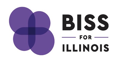
* Perhaps you can help explain this campaign logo to me?…
…Adding… We may have a winner…
It might be a B that was rotated around the center. If you look at the right half the top part is slightly smaller than the bottom, and if you look at the B in Biss it follows the same style. Kinda weak but best I have.
Kinda makes sense.
…Adding More… Hmm…
Agree with Perrid but a little more…notice you can see the bold I and the proportional S curves…so the logo actually can spell his whole name…
posted by Rich Miller
Wednesday, Jul 26, 17 @ 10:14 am
Sorry, comments are closed at this time.
Previous Post: Pritzker “fact checks” new Rauner ad
Next Post: The “old Bruce Rauner” also opposed the bill
WordPress Mobile Edition available at alexking.org.
powered by WordPress.
The cynic in me thinks it’s a not-s0-veiled reference to Pritzker being Jewish.
I am hopeful, though not optimistic, that the cynic in me is wrong.
Comment by thunderspirit Wednesday, Jul 26, 17 @ 10:16 am
The last thing Prince worked on?
Comment by Give Me A Break Wednesday, Jul 26, 17 @ 10:17 am
“… and the Venn diagrams he controls …”
Comment by Dave Dahl Wednesday, Jul 26, 17 @ 10:17 am
It’s a purple flower with a cross in the middle of course. Catholic priests wear purple vestments before performing Reconciliation. Maybe it has something to do with that.
Comment by anonymous Wednesday, Jul 26, 17 @ 10:18 am
Its an addition sign
Comment by John Rawlss Wednesday, Jul 26, 17 @ 10:18 am
Biss for Governor: “Women. Jesus. Butterflies.”
Comment by Sgt. Slaughter Wednesday, Jul 26, 17 @ 10:18 am
thunderspirit-
Biss is Jewish as well.
Comment by Anonymous Wednesday, Jul 26, 17 @ 10:18 am
Ummmm…Biss is Jewish too.
Comment by ILGOV2018 Wednesday, Jul 26, 17 @ 10:19 am
@thunderspirit Biss is also Jewish.
Comment by Boy Blunder Wednesday, Jul 26, 17 @ 10:19 am
== Biss is Jewish as well. ==
Then my cynicism is misplaces. Mea culpa.
Comment by thunderspirit Wednesday, Jul 26, 17 @ 10:19 am
Grapes are to Biss as apples are to Madigan?
Comment by Fixer Wednesday, Jul 26, 17 @ 10:19 am
Purple in an attempt to get moderate GOPers to come over to his side?
The primary is during Lent?
Comment by From the 'Dale to HP Wednesday, Jul 26, 17 @ 10:20 am
My best guess would be - the state flower for Illinois is a Violet. I think it actually looks like a violet.
Comment by Dede Wednesday, Jul 26, 17 @ 10:20 am
I kind of see a “B” in the right half of it, but on the whole I’m missing it.
Maybe a flower? We’re growing like a flower? Nope, I got nothing
Comment by Anonish Wednesday, Jul 26, 17 @ 10:20 am
Inside joke for math nerds?
Comment by Dance Band on the Titanic Wednesday, Jul 26, 17 @ 10:21 am
Biss For Governor: Because Math Is Hard
Comment by Blue Bayou Wednesday, Jul 26, 17 @ 10:21 am
“Visit your doctor to see is Biss is right for you… “
Comment by Oswego Willy Wednesday, Jul 26, 17 @ 10:21 am
Another Bisstake.
Comment by Deft Wing Wednesday, Jul 26, 17 @ 10:23 am
If you cut out the letters B-I-S-S in purple construction paper and threw them on a table, they might look something like that…
I got nothin’.
Comment by South of Sherman Wednesday, Jul 26, 17 @ 10:24 am
I just assumed it was two intertwined infinity symbols whose overlap forms a plus sign, a nod to his former mathematician days. Just a guess though.
Comment by The Captain Wednesday, Jul 26, 17 @ 10:25 am
Subliminal SEIU messaging didn’t work for Chuy either.
Comment by City Zen Wednesday, Jul 26, 17 @ 10:25 am
“I Love You, You Love Me….”
Comment by OurMagician Wednesday, Jul 26, 17 @ 10:25 am
It looks like a logo for a pharmaceutical company. Maybe the whole campaign thing is just to raise awareness before he takes Biss Pharma public - IPO after the election?
Comment by Shamrockery Wednesday, Jul 26, 17 @ 10:25 am
bisstake
Comment by Nikolai Mnev Wednesday, Jul 26, 17 @ 10:29 am
Looks like a new idea right out of the 70s…
Comment by Liberty Wednesday, Jul 26, 17 @ 10:30 am
It’s a subtle way to make sure he gets the Skokie/Evanston vote. There’s an awful lot of purple up there.
Comment by Sam Weinberg Wednesday, Jul 26, 17 @ 10:31 am
Because Catholic Charities said he could use it for free?
Comment by Chicago Cynic Wednesday, Jul 26, 17 @ 10:31 am
It’s a transition.
Soon it will be just the logo and he’ll be The Politician Formerly Known as Biss.
“Purple reign, purple reign….”
Comment by wordslinger Wednesday, Jul 26, 17 @ 10:31 am
–It looks like a logo for a pharmaceutical company.–
Yeah, or a hospital.
Comment by Ron Burgundy Wednesday, Jul 26, 17 @ 10:31 am
The logo actually has all of the letters to his last name in it, plus it has addition, subtraction, and infinity signs…because he is a mathematician and is smarter than you.
You have to have Mensa level intellect to understand.
Comment by Phenomynous Wednesday, Jul 26, 17 @ 10:32 am
Let’s break it down:
Purple is often seen as a more “feminine” color, and right now there are no women in either primary for governor. So Biss, by using purple as his ONLY color, is signaling to women voters that he is their candidate.
Smart. A+.
Comment by Politically Buff Wednesday, Jul 26, 17 @ 10:32 am
should be “better than this” . . . .
Comment by Truthseeker Wednesday, Jul 26, 17 @ 10:35 am
That is the worst logo (not just political logo) I have ever seen. The Biss campaign needs to go back to the drawing board on this one.
Comment by Just Observing Wednesday, Jul 26, 17 @ 10:36 am
Maybe the inspiration for Biss’ logo was his discredited research showing that circles are really just bloated triangles. As you can see very clearly, here is an example of four shapes that are both triangles and circles at the same time. He was right all along!
Comment by TopHatMonocle Wednesday, Jul 26, 17 @ 10:36 am
==bisstake==
Bisstake by the Lake?
Comment by City Zen Wednesday, Jul 26, 17 @ 10:37 am
Looks like two interlocked infinity symbols and a cross. I’m thinking a math reference with a connotation of endless possibility. But it does remind me of a health care logo.
Comment by 46 and 2 Wednesday, Jul 26, 17 @ 10:37 am
OW gets the spit out coffee laughter from me:
“Visit your doctor to see is Biss is right for you… “
Comment by Dan Bureaucrat Wednesday, Jul 26, 17 @ 10:38 am
Dave Dahl is on the right track - thinking of venn diagrams. The mathematician bringing the overlapping entities (government branches - people) together. That’s my guess.
Comment by Professor Wednesday, Jul 26, 17 @ 10:39 am
Purple, beyond being the “swing state” or, you know, a combination of red and blue, is often associated with feminist organizations and LGBT orgs and is also sometimes (for those reasons) adopted for progressive causes. The shape itself? No clue
Comment by MissingG Wednesday, Jul 26, 17 @ 10:39 am
I hate to see what happens when the bubble(s) bursts.
Comment by Curl of the Burl Wednesday, Jul 26, 17 @ 10:40 am
It might be a B that was rotated around the center. If you look at the right half the top part is slightly smaller than the bottom, and if you look at the B in Biss it follows the same style. Kinda weak but best I have.
Comment by Perrid Wednesday, Jul 26, 17 @ 10:40 am
I think Perrid may be right.
Comment by Rich Miller Wednesday, Jul 26, 17 @ 10:41 am
1) Maybe an attempt to be different and eye-catching.
2) An intern went looking through “free-images-for-you.com” and that was the best alternative.
Comment by lake county democrat Wednesday, Jul 26, 17 @ 10:41 am
Kinda looks like a “JB” to me.
Comment by SinkingShip Wednesday, Jul 26, 17 @ 10:42 am
I look forward to his campaign explaining this
Comment by MissingG Wednesday, Jul 26, 17 @ 10:43 am
I think it’s a kind of venn diagram whose intersections create a plus sign - sort of a “stronger together” idea. If that’s true I like the concept but agree that it’s not the clearest.
Lots of good reasons for purple. NU in his district, LGBTQ, good for all genders, bipartisanship etc.
Comment by Periwinkle Wednesday, Jul 26, 17 @ 10:46 am
The Montreal Expos logo was easier to decipher.
Comment by City Zen Wednesday, Jul 26, 17 @ 10:47 am
If Perrid is right, then it’s just astonishingly bad execution of an idea. It’s so breathtakingly awful. Like New Coke awful.
Comment by Anon0091 Wednesday, Jul 26, 17 @ 10:48 am
I agree that it’s inspired by the letter “B.”
The correct “B” is flipped, and then flopped, but there is still “common ground” and “intersection.”
This probably sends signals to the far-left, especially with the color purple.
A little disruption in the military today for the flip-flopped group…
Comment by cdog Wednesday, Jul 26, 17 @ 10:48 am
==NU in his district==
In that, it’s a bit similar to candidates with U of I connections using orange and blue. But the Illini have a statewide reach that Wildcats lack.
Comment by Arsenal Wednesday, Jul 26, 17 @ 10:49 am
Purple for Northwestern. The rest? Not sure.
Comment by Obviously Wednesday, Jul 26, 17 @ 10:50 am
Looks like my evolving screensaver orb froze and somehow landed on a campaign logo
Comment by Libertarian Madman Wednesday, Jul 26, 17 @ 10:50 am
Back to the drawing board. Please.
Comment by Anon III Wednesday, Jul 26, 17 @ 10:57 am
It’s the rejected logo change for Advocate Health. The hospital/health care logo didn’t work for Hillary. Don’t think it’ll work for Biss.
Comment by CLJ Wednesday, Jul 26, 17 @ 10:59 am
==I think Perrid may be right.==
Perrid is absolutely right.
And……
This states unequivocally that Biss supports the legalization of Recreational Cannabis.
Just ask dirreP.
Comment by A guy Wednesday, Jul 26, 17 @ 10:59 am
I’d really love to see how awful the runners up were in the logo competition. I mean, if this is the winner, the one Biss fell in love with, the one that will be featured on all of his campaign advertising for the next 8 months, imagine what the losing logos must have been.
Comment by 47th Ward Wednesday, Jul 26, 17 @ 11:00 am
Agree with Perrid but a little more…notice you can see the bold I and the proportional S curves…so the logo actually can spell his whole name…
Comment by Mod Dem Wednesday, Jul 26, 17 @ 11:15 am
Obviously purple clematis.
In witchcraft, clematis symbolizes ingenuity and mental prowess.
Clearly, this is a Wicca thing.
Comment by Free Set of Steak Knives Wednesday, Jul 26, 17 @ 11:16 am
Pffft, it’s clearly “art”…or something
Comment by Anonymous Wednesday, Jul 26, 17 @ 11:17 am
His team probably told the designers to do something that looks like Math so they merged Venn Diagrams with a Plus Sign and Voila!
Comment by Grand Avenue Wednesday, Jul 26, 17 @ 11:18 am
Wait, I know, it’s one of those 3D pictures like the posters from years ago. If you stare at it the correct way, you’ll see a 3D image of the math formula that fixes all the State’s problems. Or a giraffe. Or a tank.
Comment by Anonymous Wednesday, Jul 26, 17 @ 11:20 am
Looks like Barney the Dinosaur’s EPT results.
Comment by enoughalready Wednesday, Jul 26, 17 @ 11:20 am
I think Phenomynous might be right lol.
Comment by Phemonynous Wednesday, Jul 26, 17 @ 11:23 am
Were their high fives in the campaign office when they decided on this logo? I really hope there weren’t high fives.
Comment by Montrose Wednesday, Jul 26, 17 @ 11:23 am
“Listen to what the flower people say…”
A golden oldie from “Spinal Tap.”
Comment by W Flag Wednesday, Jul 26, 17 @ 11:27 am
Inspired by the flower of choice for Milton Berle’s Guest Villain on the “Batman” series, “Louie the Lilac.”
Comment by Ron of Japan Wednesday, Jul 26, 17 @ 11:29 am
Think Perrid and Mod Dem are right.
Also has the math connotation with infinity/venn diagrams.
Comment by 46 and 2 Wednesday, Jul 26, 17 @ 11:30 am
Goodness, didn’t realize how many qualified graphic art and design critics frequented this blog.
Comment by de-sine Wednesday, Jul 26, 17 @ 11:31 am
File under “overthinking it.” Which that probably should be the campaign Slogan for his entire campaign.
Comment by Saluki Wednesday, Jul 26, 17 @ 11:36 am
It’s something he came up with hoping 100 commentors would raise his name, if not his hopes.
Comment by Anonymous Wednesday, Jul 26, 17 @ 11:36 am
“We’re at a cross roads.”
And, the conjoining sections are darker.
“We’re stronger together.”
Comment by Political Animal Wednesday, Jul 26, 17 @ 11:36 am
Biss says “I am no longer in mathematics” when asked about the errors that permeated his PhD thesis and research papers.
http://retractionwatch.com/2017/02/23/false-results-retracted-paper-senator-inaccurate-not-fraudulent-say-editors/
Comment by The Old Professor Wednesday, Jul 26, 17 @ 11:38 am
Some people will find it strangely appealing. Others will find it oddly off-putting. Basically the same way people respond to the candidate.
Comment by JBiss Wednesday, Jul 26, 17 @ 11:39 am
– qualified graphics and design critics–
Tut-tut. Big voting bloc, are they?
Might be a better idea to communicate something to the unwashed masses. The Return of the Blob ain’t cutting it.
Comment by wordslinger Wednesday, Jul 26, 17 @ 11:44 am
- Phenomynous - Wednesday, Jul 26, 17 @ 10:32 am:
The logo actually has all of the letters to his last name in it, plus it has addition, subtraction, and infinity signs…because he is a mathematician and is smarter than you.
You have to have Mensa level intellect to understand.
“I’m even smarter than former federal prosecutors.”
Comment by Leatherneck Wednesday, Jul 26, 17 @ 12:04 pm
Maybe Biss can condescendingly explain what it means and remind everyone that they’re really not that smart.
Comment by Karen Wednesday, Jul 26, 17 @ 12:16 pm
I get it, totally. ==> Daniel, better think again.
Comment by X-prof Wednesday, Jul 26, 17 @ 12:22 pm
I think it’s a pretty nothing logo, but least it’s not a B with a wing on it.
Comment by MissingG Wednesday, Jul 26, 17 @ 1:47 pm
Biss, headed back to the classroom
Comment by Amalia Wednesday, Jul 26, 17 @ 2:09 pm
And after all of the thought that probably went into this abstract logo, they attach it to the most nondescript and mundane font ever.
Comment by Anonymous Wednesday, Jul 26, 17 @ 3:02 pm
I don’t know what the logo as a whole is intended to mean, but I’m pretty sure the darkest spot in the middle represents the small fraction of Illinoisans that would actually vote for Biss.
Comment by Trump2020 Wednesday, Jul 26, 17 @ 4:15 pm
The guy knows his way around the statehouse, I’ll take that over a graphic designer any day.
Comment by Periwinkle Wednesday, Jul 26, 17 @ 4:42 pm
Silly ppppeople. P is for progressive.
Comment by blue dog dem Thursday, Jul 27, 17 @ 7:35 am