
|
Map shows historical decline of county populations, with about a third peaking between 1870 and 1900
Wednesday, Sep 11, 2024 - Posted by Rich Miller * This map is from a PowerPoint displayed at a recent faculty Senate meeting at Western Illinois University. Click the pic for a larger image… 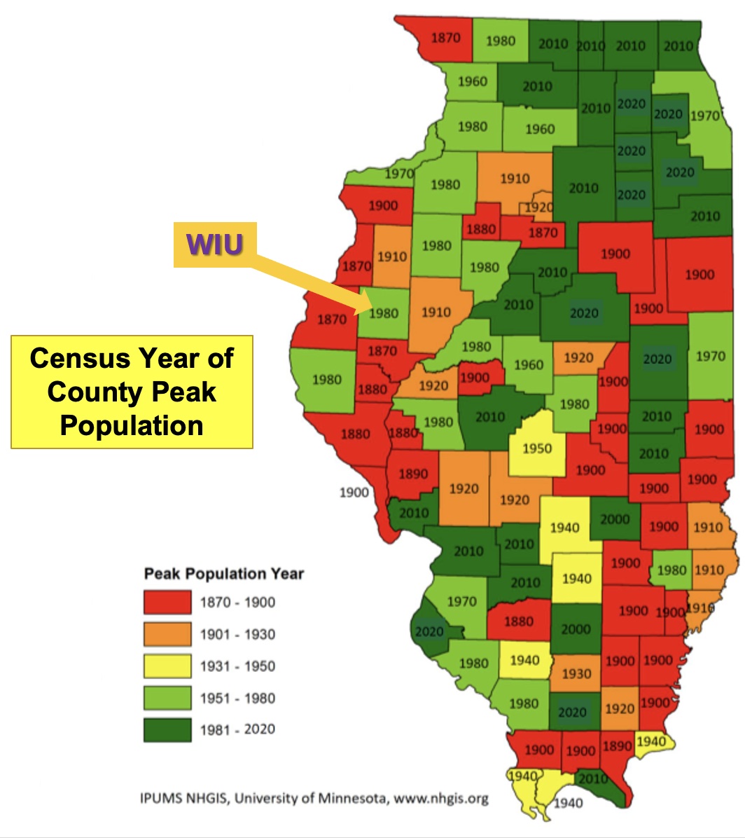 The full document is here. Discuss.
|


- Thomas Paine - Wednesday, Sep 11, 24 @ 12:11 pm:
You cannot ignore the impact of higher education jobs when you see all of those green counties with universities as islands of dark green in a sea of orange and red.
- TJ - Wednesday, Sep 11, 24 @ 12:14 pm:
Suburbs of major cities and college towns, I take it, represent the places where folks are more interested in living than others, to no real surprise.
- Incandenza - Wednesday, Sep 11, 24 @ 12:17 pm:
From the Power Point: “Illinois should be a net importer of students”
This is possibly the best observation, and can only happen if Illinois puts more money into it’s other systems like Western, Southern, Northern and Eastern. Those systems are close to other states and COULD be capturing students from our Republican-led neighboring states. IL just needs to give those schools a little extra cushion of funding to do so. Right now over 50% of the funding goes to the UofI system.
- Retired SURS Employee - Wednesday, Sep 11, 24 @ 12:23 pm:
That is a fascinating map. It so much about past and current population trends.
- Chicagonk - Wednesday, Sep 11, 24 @ 12:26 pm:
@Incandenza - It would be smarter to focus on two of the four (Southern and Northern). There really needs to be some fresh thinking and creativity in this state when it comes to higher ed.
- up2now - Wednesday, Sep 11, 24 @ 12:35 pm:
I think the map also reflects declines in coal mining and oil production in the southern and southeastern areas of the state.
- TJ - Wednesday, Sep 11, 24 @ 12:37 pm:
Also, special shoutout to Bloomington-Normal and Champaign-Urbana being the co-main economic drivers for Central Illinois. McLean and Champaign Counties have yet to peak.
- Amalia - Wednesday, Sep 11, 24 @ 12:39 pm:
recent conservative complaining that there are too many governments in Illinois. Hope this map reminds that there are so many counties and wonder if we really need that to be the way we govern.
- Proud Papa Bear - Wednesday, Sep 11, 24 @ 12:41 pm:
“ I think the map also reflects declines in coal mining and oil production in the southern and southeastern areas of the state.”
True and another factor is that we used to have many family farms that needed big families for manual labor.
Nowadays, a lot of farms have been condensed and/or corporatized with automation. There’s just not a need for as many workers so they’ve migrated to where the jobs are.
- Macon Bakin - Wednesday, Sep 11, 24 @ 12:45 pm:
Washington county is about to hit a new record population with just a bit of metro east sprawl
- Res Melius - Wednesday, Sep 11, 24 @ 12:56 pm:
Map also demonstrates the impact of relative change in the freight and transportation corridors from water to rail to highway.
- City Zen - Wednesday, Sep 11, 24 @ 1:07 pm:
From the doc: “Illinois should be a net importer of students”
Good luck with that. Both IL and NJ have been the biggest exporters of higher ed students for years. Illinois is surrounded by top notch Big10 schools more than happy to poach our kids. Now SEC schools are luring them as well. Tennessee or Alabama look better on a resume that ISU.
Our high property taxes are a huge detriment to the directional schools as parents spending a couple hundred thousand dollars over the years want some prestige behind their education investment that E/W/N/SIU can never offer.
It also didn’t help that UIUC spent a few decades shooing away their own residents for more lucrative offshore students. Now they’re left with a dispassionate alumni base. And when Big10 grads from other states take up residence here, their allegiance lies with their alma mater, not UofI.
- Socially DIstant watcher - Wednesday, Sep 11, 24 @ 1:18 pm:
Secessionists are doing best in counties that are shrinking the most. Actually leaving would be disastrous for them.
- Give Us Barabbas - Wednesday, Sep 11, 24 @ 1:24 pm:
Those red areas not coincidentally are where a lot of the tin foil hard right elderly white guys live. The demographic shifts beneath their feet, they explain away as liberal politics.
- JS Mill - Wednesday, Sep 11, 24 @ 1:24 pm:
=Tennessee or Alabama look better on a resume that ISU.=
Evidence?
Also, it does not cost a “couple hundred thousand dollars” to send a child to ISU/NIU/SIU/SIUE/EIU/WIU.
- BCOSEC - Wednesday, Sep 11, 24 @ 1:29 pm:
up2now is correct IMO. However, there are some rural counties “in the green” that aren’t near cities or contain college towns. What do they have going for them?
Also, if we dig deeper, some of the ones that peaked over 100 years ago haven’t lost a lot of population on the whole, while others have.
- Anyone Remember - Wednesday, Sep 11, 24 @ 1:30 pm:
===It also didn’t help that UIUC spent a few decades shooing away their own residents for more lucrative offshore students.===
Under Blago that was the unstated policy. Offshore students could be charged MORE than they cost, making them a “profit center” … .
- 47th Ward - Wednesday, Sep 11, 24 @ 1:44 pm:
===What do they have going for them?===
Access to transportation and medical centers?
- Amalia - Wednesday, Sep 11, 24 @ 1:59 pm:
SEC schools luring with free education.
- Bogey Golfer - Wednesday, Sep 11, 24 @ 2:18 pm:
In the 1970’s, Western Illinois was referred to as “Forgotonia”, due in part to the lack of an Interstate Highway running through it. Today it appears to render true.
- Donnie Elgin - Wednesday, Sep 11, 24 @ 2:18 pm:
=some of the ones that peaked over 100 years ago haven’t lost a lot of population on the whole, while others have=
This is exactly right, what is the delta of the change from the peak?
- Homebody - Wednesday, Sep 11, 24 @ 2:31 pm:
If you look at a map of Chicago population over time, it basically mimics this pattern. The nicer areas are still having lots of new construction and people moving in, but the lower income areas that have lost manufacturing jobs and the like over time are the ones leaving.
- Responsa - Wednesday, Sep 11, 24 @ 2:36 pm:
–It also didn’t help that UIUC spent a few decades shooing away their own residents for more lucrative offshore students. Now they’re left with a dispassionate alumni base. ==
Yes. As a member of the UIUC Alumni Association I just got a fancy anoouncement that I can order a special limited edition snow globe of Memorial Stadium in commemoration of its 100th birthday. Ha Ha, Talk about not reading the alumni room.
- Aaron B - Wednesday, Sep 11, 24 @ 2:37 pm:
===However, there are some rural counties “in the green” that aren’t near cities or contain college towns. What do they have going for them?===
I went through the green counties south of the Sangamon/Macon/Coles area (Lincoln Land, Richland, and Lake Land community college counties) and most of the green counties down there have community colleges in them. The only green counties that I found that don’t have community colleges in them (or very nearby) are Bond, Effingham, Monroe, and Randolph.
Also of note is that 5 counties that do contain a community college are not green. 3 of those 5 are Illinois Eastern College campuses so not sure how that changes things. Crawford (IEC), Wayne (IEC), Wabash (IEC), Pulaski (Shawnee CC), and Saline (Southeastern CC).
- dtownresident - Wednesday, Sep 11, 24 @ 2:44 pm:
Schools like Southern and Eastern have done a much better job for competitive aid packages for in state students. Without aid it should be no more than 100,000 or so….With the current scholarships for good students it is less than that. All of the Illinois schools could do a better job of having scholarships available. Neither of my daughters went to in state schools but it was because of where they wanted to be. One is in a school that would still be cheaper but others do not. It does seem that the town the college is in also affects this. Towns like Kirksville in Missouri are also struggling to attract students compared to a few years ago and they do not have all the challenges Illinois has had under Blago or Rauner.
- btowntruth from forgottonia - Wednesday, Sep 11, 24 @ 2:45 pm:
A LOT of Forgottonia had peak population years 100 years ago…..
- Incandenza - Wednesday, Sep 11, 24 @ 3:43 pm:
= It would be smarter to focus on two of the four (Southern and Northern). There really needs to be some fresh thinking and creativity in this state when it comes to higher ed. =
Why just those two. There are fine universities in Western and Eastern as well.
Western has an extremely low cost of living and is on an Amtrak line. There’s a lot to recommend it, especially with the new performance arts plant. It can try to attract international students and students in close-by Iowa with low cost and perhaps less stringent entry requirements.
- TJ - Wednesday, Sep 11, 24 @ 3:53 pm:
== Tennessee or Alabama look better on a resume that ISU. ==
Okay, and? Even if your hypothesis is true, which I’m not sure it is for at least the latter, you’re telling me that one state’s flagship’s university has better resume power than another state’s secondary or tertiary public school? I don’t think many would disagree with that assertation in most circumstances.
But I’d bet dollars to donuts that Illinois looks better on a resume than Tennessee or Alabama, and that Illinois State looks better on a resume than Tennessee Tech or Alabama A&M.
- Larry Bowa Jr. - Wednesday, Sep 11, 24 @ 4:18 pm:
“Tennessee or Alabama look better on a resume that ISU.”
Speak for yourself. I’d assume the kid went to those places to drink and go to football games.
- 47th Ward - Wednesday, Sep 11, 24 @ 4:28 pm:
Illinois State looks pretty good on my resume.
- H-W - Wednesday, Sep 11, 24 @ 4:34 pm:
According to the State’s Equity Commission, in 2023, the state appropriated half a billion dollars to UIUC and UIC. In 2023, the state appropriated 1/20 of a billion dollars to WIU.
Equity suggests the state could do better in maintaining its system of public higher education so as to serve all citizens across the state equally.
- Friendly Bob Adams - Wednesday, Sep 11, 24 @ 4:55 pm:
Amalia- can you provide more detail on the SEC free education? Had not heard of that before. Thanks.
- City Zen - Wednesday, Sep 11, 24 @ 7:53 pm:
==Illinois looks better on a resume than Tennessee or Alabama, and that Illinois State looks better on a resume than Tennessee Tech or Alabama A&M.==
Agreed, but the kids not going to UIUC are choosing Tennessee or Alabama over the directionals.
- Lynn S. - Wednesday, Sep 11, 24 @ 9:22 pm:
I’m counting 12 counties that peaked between 1870-1890? Yikes (banned punctuation).
Majority are along the Mississippi river, but still…Forgotonia may indeed be the best description for them.
Would also love to see this type of mapping done for Iowa, Missouri, Kansas, Nebraska, the Dakotas. Supposedly large chunks of the Great Plains have less population than when they had Indian tribes.
- Scamp640 - Wednesday, Sep 11, 24 @ 9:53 pm:
@ Lynn S. If you click through the link above, you can see the entire PowerPoint and the name of the author. If you email the author at WIU, he can send you maps showing the peak populations by county for Iowa, Kansas, and so forth.
- Lynn S. - Thursday, Sep 12, 24 @ 9:54 am:
@ Donnie Elgin 2:18
Can’t speak for all the counties, but I grew up in one that peaked in 1900. Population has gone from about 14,000 to about 10,500 in 2020 census, for a delta change of about 35%. A neighboring county that also peaked in 1900 has gone through about the same rate of decline; 2020 census for them was about 9500.
(Smallest county in Texas has about 91 citizens; they have basically combined their government with the next county over, but that county’s not very big, either. )