|
Please, LIS, don’t mess up your new site
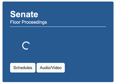
Tuesday, Nov 12, 2024 - Posted by Rich Miller * The Legislative Information System’s General Assesmbly website may be old, but it works and its minimalism makes it fast and fairly easy to use. It’s new “beta” site looks nice and all, I suppose, but take a look at this…  Javascript to slowly load the time of today’s session? Click around yourself and give us some thoughts on the beta site.
|


- Newsite? - Tuesday, Nov 12, 24 @ 12:34 pm:
I’m not super tech but I think that may have more to do with your internet speed than the new site. Works great for me!
- InWithTheNew - Tuesday, Nov 12, 24 @ 12:38 pm:
WOW! This is a much needed face lift. When i am clicking around and navigating, everything seems to work well for me. I like the home page layout. Love that the Members pictures are on the members page so you can see what they look like right away.
Great Job!
- beta means new - Tuesday, Nov 12, 24 @ 12:40 pm:
Looks great for the new age and easier to read for the younger generation working in state government. Grey beards might struggle though. Also, beta already implies that it is new or in a preliminary stage.
- Excitable Boy - Tuesday, Nov 12, 24 @ 12:44 pm:
There seem to be a lot of “new” commenters on this post. Listen to Rich, LIS, he knows something about disastrous website upgrades.
- ;) - Tuesday, Nov 12, 24 @ 12:46 pm:
It’s a bad upgrade.
- Google Is Your Friend - Tuesday, Nov 12, 24 @ 12:48 pm:
Javascript can also have instances blocked by adblockers.
- levivotedforjudy - Tuesday, Nov 12, 24 @ 12:56 pm:
I like it. I work with a group that is relatively new to advocacy. This navigates well for someone who won’t be looking up bills everyday and is very adept at the process.
- Rich Miller - Tuesday, Nov 12, 24 @ 1:03 pm:
===that may have more to do with your internet speed===
A government website should be designed to be used by people with slower internet speeds.
- Change Agent - Tuesday, Nov 12, 24 @ 1:28 pm:
It’s fine as far as facelifts go. But it doesn’t fix the biggest functional issue - the separate ilga.gov and dashboard websites.
- Rich Miller - Tuesday, Nov 12, 24 @ 1:33 pm:
What Hannah said
- roart - Tuesday, Nov 12, 24 @ 1:35 pm:
It’s giving 2007 vibes, but if it’s accessible and works, that’s what matters.
- Lamb - Tuesday, Nov 12, 24 @ 1:41 pm:
wake me up when they join the rest of the Union in posting archived video of floor debate and committee hearings
- SweetLou86 - Tuesday, Nov 12, 24 @ 1:54 pm:
I gotta agree with Hannah. I had to use the websites for other state legislatures last year for a grad school project and let me tell you, we got it real good, Illinois. It may be minimalist, but it’s intuitive and generally pretty easy to navigate and find information quickly. New and flashy isn’t always better.
- Grateful - Tuesday, Nov 12, 24 @ 2:23 pm:
Much improvement. It looks nice. Great work LIS
- Michelle Flaherty - Tuesday, Nov 12, 24 @ 3:03 pm:
Change is bad
- confused - Tuesday, Nov 12, 24 @ 3:21 pm:
It literally looks identical
- Wisco Expat - Tuesday, Nov 12, 24 @ 4:10 pm:
Confused, they already revoked access to the beta site. Clicking on the link to the beta site just takes you to the original site. Access to the beta site was only active for a few hours today.
- Matty - Tuesday, Nov 12, 24 @ 4:15 pm:
-I had to use the websites for other state legislatures last year for a grad school project and let me tell you, we got it real good, Illinois.-
Yes. Being so familiar with ILGA and then doing research on statutes in other states can be a very daunting task, leading to dead ends and rabbit holes of information you’re not looking for.
- Huh? - Tuesday, Nov 12, 24 @ 10:48 pm:
“Don’t fix what ain’t broken!”
Signed IMRF retirees. They “fixed” their website in March 2024 and broke it.