* St. Louis Public Radio…
[Ted Kaye of the North American Vexillological Association] and fellow flag enthusiasts have even put together their own edits of some of the final designs, which had been whittled down from a field of nearly 5,000 by members of the Illinois Flag Commission.
The fundamental changes made to the finalists center around simplicity and being able to identify a flag at a distance.
“I think it’s very important to get back to that fundamental purpose of discernibility and memorability,” Kaye said. “Each of these designs could be made more simple and more effective as a design. There are some that just don’t really say Illinois, and others that really do. And those that say Chicago.”
For instance, Kaye said he’d change every flag with a six-point Chicago star for a classic five-point star to better represent the entirety of the state.
Through Feb. 14, you can vote once every 24 hours on 10 finalists. Click here to vote.
* The original options…
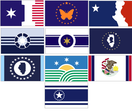
* Here are Kaye’s redesigns…
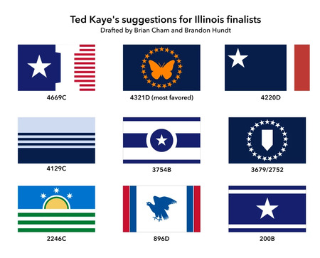
What are your thoughts? Are these redesigned flags any improvement?
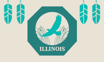
…Adding… [By Rich] From Prairie Band Potawatomi Nation on not being selected as a finalist by the state panel…
“As leaders of the Prairie Band Potawatomi Nation, we express our profound disappointment in the decision not to select a new design for the Illinois state flag that acknowledges the historic and enduring contributions of Tribal Nations to the region.
“Illinois takes its name from the Illiniwek Confederation, a collective of Indigenous Nations whose lands, cultures and governance shaped this region long before statehood. Tribal Nations, including the Prairie Band Potawatomi Nation, maintain deep connections to these lands and continue to contribute to the state’s cultural and historical richness.
“A new state flag was a meaningful opportunity to educate the public, honor the past, and demonstrate a commitment to reconciliation with the Indigenous peoples of this land.
“We urge Illinois leaders and residents to reflect on the significance of inclusion and to consider how the state can better represent and honor its shared history. A future where Illinois acknowledges its Indigenous foundations is not only possible but necessary for fostering mutual respect and understanding.
“The Prairie Band Potawatomi Nation remains committed to dialogue and partnership, and we stand ready to support efforts that center truth, respect and recognition in the state’s symbols and policies.”
The nation’s submission…





- Scooter - Thursday, Jan 23, 25 @ 8:48 am:
896D reminds me of the old (1990s?) USPS logo .
- ChicagoVinny - Thursday, Jan 23, 25 @ 8:50 am:
I kinda like 4220D or 4321D
- flagtime - Thursday, Jan 23, 25 @ 8:55 am:
Not a fan of dropping the 6-pointed star on any of these. Don’t mind losing the state outline and Lincoln silhouettes.
- Anyone Remember - Thursday, Jan 23, 25 @ 8:58 am:
No. Favorite is still Lincoln’s laser beams taking out the Confederate Flag …
- Alton Sinkhole - Thursday, Jan 23, 25 @ 8:59 am:
Redesigned are nearly all worse, I think.
- Hyperbolic Chamber - Thursday, Jan 23, 25 @ 9:01 am:
Not generally. 4220D & 4321D are the best of the redesigns, imo. I prefer the original versions of 4129C and 3754B out of the 19.
- BlockedRRCrossing - Thursday, Jan 23, 25 @ 9:05 am:
I despise all of his redesigns (wdym simplifying - don’t we want something unique??), let along the final 10 that were chosen. Over 5000 flags were submitted and these were the best ideas anyone came up with.
- Neef Jr. - Thursday, Jan 23, 25 @ 9:05 am:
the vote link doesn’t work. Just brings us back to the post.
- Isabel Miller - Thursday, Jan 23, 25 @ 9:06 am:
== vote link doesn’t work==
Fixed! Sorry about that!
- ChicagoBars - Thursday, Jan 23, 25 @ 9:12 am:
Never trust a man who hates on a six pointed Chicago star - ancient proverb
- Benjamin - Thursday, Jan 23, 25 @ 9:12 am:
Uh, yeah, they kind of blandified them all. One of the marks of a good flag is that they have meaningful symbolism, you know.
- Pundent - Thursday, Jan 23, 25 @ 9:12 am:
Some are better (4669). Some are worse (3679). And some bear no resemblance to the original design (4220).
- ChicagoBars - Thursday, Jan 23, 25 @ 9:14 am:
Redesigned 896D looks less like a state flag and more like a battle standard for the Pigeon Liberation Front.
- Scott Knitter - Thursday, Jan 23, 25 @ 9:14 am:
I think the one with the big I is growing on me. As for the butterfly one, I’d like it a lot without the circle of stars. Just the butterfly. That could be Illinois’ maple leaf.
- Wisco Expat - Thursday, Jan 23, 25 @ 9:14 am:
The original designs of the flags have symbolism that was carefully selected and thought out. The redesign just takes away any creativity and symbolism that would merit replacing the flag in the first place.
- TJ - Thursday, Jan 23, 25 @ 9:17 am:
Utterly butchered the entire purpose and appeal of the Lincoln/State profile with their redesign. Did they not recognize the shape of Abe/Illinois?
- StarLineChicago - Thursday, Jan 23, 25 @ 9:18 am:
Can’t help but notice that the Centennial Flag didn’t require any updating in this exercise
- City Zen - Thursday, Jan 23, 25 @ 9:23 am:
==Some are better (4669).==
Not sure replacing the Chicago star (which is recognizable) with a regular star improves the flag.
I like subtle references. Anything with 21 objects to signify Illinois as the 21st state should be in the winner.
Centennial flag is still the best.
- Simply Sayin' - Thursday, Jan 23, 25 @ 9:25 am:
They did a great job of making the original picks look better. About every one of their redesigns were worse.
- Donnie Elgin - Thursday, Jan 23, 25 @ 9:26 am:
= Are these redesigned flags any improvement?=
Nope - I vote daily for the current flag
- Captain Obvious - Thursday, Jan 23, 25 @ 9:26 am:
The edited 896D looks like it has a chicken in the center.
- Aaron B - Thursday, Jan 23, 25 @ 9:27 am:
IMHO the only thing better about any of the redesigned flag finalists is the changing of the 6 pointed star to 5 points. All the other changes just take away uniqueness from the designs. 4220D without the outlines of the Mississippi River and Lincoln basically removes everything Illinois about the flag.
- Norseman - Thursday, Jan 23, 25 @ 9:27 am:
Using an ancestral phrase: Uff Da.
- Near Westside - Thursday, Jan 23, 25 @ 9:28 am:
They just made some bad designs more boring. 896D in particular, what kind of bird is that supposed to be?
- Mel - Thursday, Jan 23, 25 @ 9:29 am:
wow they lost all their compelling design quirks and became boring and corporate
- Yellow Dog Democrat - Thursday, Jan 23, 25 @ 9:30 am:
Denying the importance of Chicago is like denying the importance of agriculture or transportation to the state’s past and future. You are just playing into institutionalized racism that is more than a century old. Say the quiet part out loud:, Ted: “The flag cannot mention Chicago because Black people live there, and some people might not want to be associated with Black people.”
Any flag featuring a lone star is a #facepalm. We already have a Lone Star State. 4220D could be the Texas state flag in fact, or Chile: a lone white star on a field of blue with adjacent fields of white and red.
What this says to me is we need a do-over.
- Rabble - Thursday, Jan 23, 25 @ 9:41 am:
The current flag remains the best.
- Yellow Dog Democrat - Thursday, Jan 23, 25 @ 9:45 am:
As an aside, the use of negative space is far too clever. A flag should not be an optical illusion.
If I were going to “improve” on the Block I flag, for example, i would change the I to red and turn the field of stripes white. That would make the I pop out I think.
instead of changing the white star to 5 point to make it more like Texas and Chile, I would change it to a gold star. Gold and blue are a great color combo, and it offers multiple symbolic interpretations: the sacrifice of gold star families, a reflection of our golden fields of grain, commercial wealh, a state that stands out from the others.
In design, gold evokes feelings of success, wealth, celebration.
- Roman - Thursday, Jan 23, 25 @ 9:48 am:
Some of the redesigned are an improvement, but some completely undermine the purpose of the original design. For instance, the star in the second row, middle flag is a the six point star from the Chicago flag and is intended to symbolize Chicago’s roll in the state. The redesign changes it to a generic five point star, which makes it kinda meaningless.
- Occasionally Moderated - Thursday, Jan 23, 25 @ 9:51 am:
896D looks like a turkey vulture landing on the road to feed on carrion.
- @misterjayem - Thursday, Jan 23, 25 @ 9:52 am:
I didn’t like any of the original proposals (centennial flag all the way), but I don’t understand the purpose of the redesigned, emblandified flags.
“A child should be able to draw it — and be bored to death when doing so.”
– MrJM
- Joe Schmoe - Thursday, Jan 23, 25 @ 9:55 am:
A total waste of time. The present flag is dignified and formal. The rest of them look like they could fly in front of a Chuck E. Cheese….
- Aaron B - Thursday, Jan 23, 25 @ 9:57 am:
I’d be just fine with getting rid of any single stars completely versus having it be a 6 pointed star. The 5 pointed star is meant to be a reference to the 5 pointed stars on the US flag, not trying to mimic Chile, Cuba, Djibouti, or any other flag that has a star. As for the 5 pointed vs 6 pointed star, Illinois already suffers from MANY people outside of Chicago having the delusion that Chicago is the worst feature of the state. Putting a 6 pointed star on the flag would just reinforce that idea. Chicago has their own city flag, leave the 6 pointed stars there.
- ChicagoBars - Thursday, Jan 23, 25 @ 10:02 am:
For anyone building ramparts to die on over the fate of the current State flag…haul yourself out to Mount Rushmore this year. Get yourself a lemonade or other cold beverage. Walk the promenade leading to the base of the monument two or three times. It is lined by all 50 State flags. That walk for me was when I realized ol’ “Eagle Eating Bacon” wasn’t even in top 2/3 of all US state flags.
The new designs might or might not be better but the current state flags is really unimpressive compared to most other states.
(Don’t forget to check out Custer State Park bearby when you go - banned punctuation - it was amazing).
- New Day - Thursday, Jan 23, 25 @ 10:03 am:
“896D reminds me of the old (1990s?) USPS logo.”
My thought exactly.
This whole exercise is a massive waste of time and money. They new designs are no better than the existing design. I truly hope that’s where we wind up. In one of the articles one of the leaders of the effort said they did they best they could with what they had. Talk about damning with faint praise.
Just vote for the existing flag and let’s move on.
- NIU Grad - Thursday, Jan 23, 25 @ 10:04 am:
Automatically so much better. The Commission should have really refined the finalists before posting the originals for a vote.
- Donnie Elgin - Thursday, Jan 23, 25 @ 10:05 am:
Having successfully worked on designs of logos and branding with a Board of Directors at an an organization I work with - here is my suggestion to the State: Ditch the public submission - instead work with design and Flag professionals to come up with three acceptable designs - and then let the public vote and select the best. That way they still have both quality control and give the public a choice
- Carpe GM - Thursday, Jan 23, 25 @ 10:12 am:
The one with the green is the only one that stands out.
- lowdrag - Thursday, Jan 23, 25 @ 10:15 am:
Waste of time and money. Nothing wrong with current flag.
- Huh? - Thursday, Jan 23, 25 @ 10:15 am:
What rabble said x2
- sulla - Thursday, Jan 23, 25 @ 10:15 am:
Apparently, I am at complete odds with the experts at the North American Vexillological Association.
All of these proposed flag replacements and the redesigned replacements look like the thumbnails of apps on my phone’s home screen. They’re all bleak, corporate and instantly forgettable.
I want a flag embossed with cryptic latin phrases referencing duty and honor. I want a coat-of-arms styled crest and majestic animals on my flag. My state flag ought to look like something a Byzantine soldier would paint on his shield before manning the ramparts.
- H-W - Thursday, Jan 23, 25 @ 10:19 am:
3679/2752, the flag I originally preferred, now looks like a post-it tab marker, surrounding by stars. Nothing Illinois about that.
- Soccermom - Thursday, Jan 23, 25 @ 10:19 am:
I have never been a fan of the current flag (even though I fly it outside my house.) But the finalists are not an improvement, and the “professionally updated” ones are just boring.
- HSI - Thursday, Jan 23, 25 @ 10:23 am:
When you ask for the publics input what you get is Flaggy McFlagface.
- Roman - Thursday, Jan 23, 25 @ 10:34 am:
@ChicagoBars, I had the exact same experience at Mount Rushmore a few years ago. We easily have one of the worst state flags. (Having said that, I’m disappointed by the new design proposals.) Ditto on Custer State Park. It’s gotta be one of the best state parks in the country.
- thisjustinagain - Thursday, Jan 23, 25 @ 10:46 am:
Meh on the original entrants; meh on the redesigns.
- ;) - Thursday, Jan 23, 25 @ 11:17 am:
These are horrible. lol.
- RNUG - Thursday, Jan 23, 25 @ 11:17 am:
Still no thrilled by any of them, but most the redesigns are an improvement in terms of making them easier to recognize.
- Center Drift - Thursday, Jan 23, 25 @ 11:18 am:
Such an amazing lack of creativity. Keep the old one.
- Flyin'Elvis'-Utah Chapter - Thursday, Jan 23, 25 @ 11:19 am:
Would love for the flag expert to explain which one of his redesigned efforts say Illinois-
up close or at a distance.
If Lincoln’s silhouette facing the western border of the state isn’t recognizable, what is?
- New Day - Thursday, Jan 23, 25 @ 11:25 am:
“Don’t forget to check out Custer State Park bearby when you go - banned punctuation - it was amazing).”
Agree on Custer. Frankly, that whole region is amazing, from the Badlands to Rushmore to Crazy Horse to the Black Hills. The trip we took a few years back so exceeded our expectations.
- It's Just a Pill - Thursday, Jan 23, 25 @ 11:32 am:
The Lincoln one is ok. The rest I would toss
- SBA_618 - Thursday, Jan 23, 25 @ 11:36 am:
2246C would be a nice flag that draws attention to the natural beauty of the State of Illinois. I am afraid many of these options have been too University of Illinois oriented. We need a beautiful flag that represents the entire state while not simply outsourcing the project to the U of I art department lolol
- SAP - Thursday, Jan 23, 25 @ 11:36 am:
The redesigns remind me of this fiasco:
https://news.artnet.com/art-world/botched-restoration-of-jesus-fresco-miraculously-saves-spanish-town-197057
- Fav Human - Thursday, Jan 23, 25 @ 12:04 pm:
I rather like the Potawattomi flag. I’d want to remove the bottom 3 feathers and swap out the bird for a prairie chicken, though.
- JoanP - Thursday, Jan 23, 25 @ 12:07 pm:
They’re all awful, both the originals and the redesigned ones. Stick with what we have at least until someone comes up with something decent.
- Panther Pride - Thursday, Jan 23, 25 @ 12:40 pm:
I really didn’t have a favorite until you shared the Prairie Band’s submission. Could do without it saying “Illinois,” but otherwise, it feels the most “Illinois” to me of any of the submission. Alas, it likely won’t matter.
- Give Us Barabbas - Thursday, Jan 23, 25 @ 12:45 pm:
As important and wonderful as Lincoln is, I don’t think any one person’s profile belongs on the state flag. One of the flags looks like an Air Force logo, another, the post office. The rest are incredibly bland and don’t visually trigger any association with the specific state.
- thechampaignlife - Thursday, Jan 23, 25 @ 12:50 pm:
Thanks, I hate them.
Seriously, though:
4669C: fine
4321D: fine
4220D: The original may be too detailed but nothing about the new one really says “Illinois”.
4129C: boring/worse
3754B: I like the original better. I am fine switching it to a 5 point star but it should stay gold.
3679/2752: As far as abstracting the shape of the state, I actually like this. It could also be interpreted as a map pin showing us as a destination and transit hub, or a bookmark, planting hoe, locomotive, chisel, pen tip, or various other relevant symbols.
2246C: fine, but I prefer the original
896D: both versions are not great
200B: boring/worse
- Beep booop - Thursday, Jan 23, 25 @ 12:58 pm:
I don’t think I prefer a single Kaye edit to the original.
- Mr. Morris - Thursday, Jan 23, 25 @ 1:01 pm:
The one with Lincoln and the outline of Illinois is growing on me. It sort of looks like a gerrymandered district between the two outlines.
- Will Stephens - Thursday, Jan 23, 25 @ 1:20 pm:
I was on the commission. One of the big problems with the whole process was the inclusion of school children making submissions. While technically we did get 4800 flag submissions, I would guess that 2000 or more of those were not able to be seriously considered, as they were some sort of crayon style design that was done by a 4th or 5th grade student. Not being critical of the kids, I am sure it was a good teaching exercise, but it didn’t produce many serious submissions. Hundreds of the designs were attempts at comedy-uploads of the Chinese Flag, or photos of a burrito, etc etc. This left at most 2000 legit designs.
Probably 500-1000 of the 2000 legit designs leaned heavily into various symbolism that featured the city of Chicago. The Skyline, the 6 pointed star, or the light blue and white pattern of the Chicago flag. The commission did not want to recommend a flag that was too regional in nature so many (if not all) of these were not forwarded into the final 10.
Likewise, many flag designs were very similar in nature. Dozens of flags featured the state bird, the Northern Cardinal on the flag. Many simply had a white-tailed deer. These symbols seemed to be too regional in a rural way, which some commission some members didn’t like so they were not advanced.
Some have been critical of there being so much Lincoln imagery. Hundreds of submissions featured Lincoln. It was the only common thread throughout the designs from adults and kids alike. So it left an impression among the group that Lincoln could be more heavily represented.
So, in conclusion, the final ten are the result of the commission attempting to bring forth flags that had some interesting design details, but would not be regional, or silly. Also, lots of reporting says 4800 submissions, but the universe of flags that could be seriously considered was much smaller than that.
- Yellow Dog Democrat - Thursday, Jan 23, 25 @ 1:38 pm:
@ChicagoBars -
Had the same experience at Mount Rushmore.
Two crazy things about Custer State Park:
Black Elk Peak, located next to Sylvan Lake, is the highest summit east of the Rockies.
If you climb Mt. Coolidge Fire Tower and look Northwest with binoculars, you will see that Chief Crazy Horse’s arm at the Crazy Horse Memorial 30 miles away is pointed straight at Custer State Park.
“My lands are where my dead lie buried.”
- Northside Jim - Thursday, Jan 23, 25 @ 1:45 pm:
Our state and country need more Lincolns. Union blue and Lincoln silhouette are so dignified and a perfect antidote to the polarization that even infects these fun policy choices.
- SAW - Thursday, Jan 23, 25 @ 2:07 pm:
Very much dislike the “simplified” designs - all of the character and interest is gone from the designs. I do love the flag from the Potawatomi Nation though.
- thechampaignlife - Thursday, Jan 23, 25 @ 2:11 pm:
===2000 or more of those were not able to be seriously considered, as they were some sort of crayon style design that was done by a 4th or 5th grade student===
The commission was fatally flawed if these types of submissions were rejected. Reject them because they are weak concepts, not because they are weak designers. The top candidates should all have been submitted to paid designers to produce professional mockups for public vetting.
- Vexed by Vexillologists - Thursday, Jan 23, 25 @ 2:17 pm:
The advocacy by the Vexillologists for states to re-imagine their seals on a bedsheet flags is admirable. The actual design work by the vexillological association strips any significant meaning out of earnest proposals. The final Minnesota flag does not resemble Somalia but is dreadfully generic and dull.
- Aaron B - Thursday, Jan 23, 25 @ 2:20 pm:
I actually quite like the Potawatomi flag added in the update. It is simple but still unique and I’m assuming that using Native American imagery in this case wouldn’t be a problem since the proposal came from the Potawatomi Nation itself.
- Loyal Virus - Thursday, Jan 23, 25 @ 3:01 pm:
I would one hundred percent vote for the Potawatomi flag.
- H-W - Thursday, Jan 23, 25 @ 3:35 pm:
I too like the Potawatomi flag. It’s bold and different.
- Bungalowhistorians - Thursday, Jan 23, 25 @ 3:45 pm:
Also prefer the Potawatomi design. It should be added to the finalists. The redesigns are worse than the original submissions to vote on.
- New Day - Thursday, Jan 23, 25 @ 4:10 pm:
The Potawatomi flag is a good start but exclusively focused on rural Illinois. And I really don’t like the color. But it’s the best start of any of the new designs. It’s why I stand with Donnie Elgin and try to vote for the existing flag every day…or every day I think of it.
- Pot calling kettle - Thursday, Jan 23, 25 @ 6:31 pm:
I also prefer the Potawatomi Nation flag (but, without “Illinois”). It is simple and unique.
- Give Us Barabbas - Thursday, Jan 23, 25 @ 6:38 pm:
There might be elements from the Patawatomi feathers that could work. Maybe a single large feather, as a background element. Or three feathers that would symbolize northern, southern and central regions by color. Blue for Northern, yellow for for central, crimson for Southern? The field could be white or gray/ silver?