Question of the day
Thursday, Mar 16, 2017 - Posted by Rich Miller
* Blair Kamin…
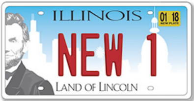
Now that Illinois’ new license plates have started appearing on cars and other vehicles, I’d like to revise an opinion from last fall, when I wrote that the plates’ design was busy and banal.
That was too kind.
In real life, with a long line of letters and numbers obscuring Abraham Lincoln’s face and all the other stuff that got thrown into this “everything but the kitchen sink” design, the new plates are hopelessly cluttered, not always easy to read, and a major lost chance to project a better image for a state that’s synonymous with political dysfunction.
You may ask: “Why is the architecture critic devoting a second column to the design of a piece of metal that measures 6 inches by 12 inches?”
Here’s why: Beyond its obvious role of identifying a vehicle and helping cops catch bad guys, a license plate should express a state’s identity and encourage outsiders to visit the state or do business there. Think of it as a mini-billboard funded by your tax dollars.
* The plate…
* The Question: Do you agree or disagree with Kamin? Explain.


- Tweed Jacket - Thursday, Mar 16, 17 @ 2:13 pm:
I’m a huge fan of simple plate designs like Vermont’s or New Mexico’s.
I will say our sport team plates are amazing though.
- Demoralized - Thursday, Mar 16, 17 @ 2:17 pm:
I agree. I was actually commenting about this to my wife the other day when we were behind a car with a new plate. The lettering on Lincoln’s image was hard to read. And, why even put Lincoln on the plate if you are going to cut his head in half. The plates are atrocious in my opinion.
- anonymous retiree - Thursday, Mar 16, 17 @ 2:25 pm:
I think the plates are hard to read on the Street.
- A guy - Thursday, Mar 16, 17 @ 2:25 pm:
I actually got mine. I agree with Demo about Abe’s head being cut in half being odd in the first place. On mine there is also a number obscuring his face even more. That actually goes for the rest of the design as well. With the numbers on it, you really don’t see anything but a gradient shift of blue to white going down. Mission NOT Accomplished. By trying to say too much…it really says nothing.
However, they do look a lot better than the 10 year old bent plates they replaced. For now.
- LTSW - Thursday, Mar 16, 17 @ 2:26 pm:
I agree. You can barely read the letters or numbers on the left side that are against the Lincoln background.
- Demoralized - Thursday, Mar 16, 17 @ 2:27 pm:
Maybe the plate is a metaphor. Lincoln has had enough and he’s leaving?
- Amalia - Thursday, Mar 16, 17 @ 2:31 pm:
what is our state identity? is it just pure Land of Lincoln? Chicago? an addition of something recognizably downstate? there’s something for everyone for a reason. chicago and downstate do not identify with each other. there really is not a state identity. you can’t just place a visual identity on something that does not have an identity. maybe a pumpkin would unite us….most pumpkin production of any state.
- Gone, but not forgotten - Thursday, Mar 16, 17 @ 2:33 pm:
I read this article this morning, then saw one on the road … the article is correct, the digit or letter that is printed on Lincoln is hard to read. The other digits or letters obscure all the other images, so it’s just busy. I still think the Capitol looks like a spaceship or mosque.
- Precinct Captain - Thursday, Mar 16, 17 @ 2:35 pm:
I think the general plates should be as bland as possible. This seems like it has too much going on.
- Anon221 - Thursday, Mar 16, 17 @ 2:35 pm:
Well… if you don’t like that one, there’s plenty of others to choose from
http://www.cyberdriveillinois.com/departments/vehicles/license_plate_guide/licenseplates.html
- wordslinger - Thursday, Mar 16, 17 @ 2:39 pm:
Agree. The design is a busy mess, aesthetically and functionally. It’s a license plate, not a jumbotron.
Let’s see the losing design, just for laughs.
- Annonin' - Thursday, Mar 16, 17 @ 2:44 pm:
Very simple if a Tribbie says it sux then citizen will agree this is the grestest F*ing design since Guttenberg
- NoGifts - Thursday, Mar 16, 17 @ 2:44 pm:
I think this short presentation about flag design has a lot to offer license plates designers too. Watch it you won’t be sorry. https://www.ted.com/talks/roman_mars_why_city_flags_may_be_the_worst_designed_thing_you_ve_never_noticed
- NoGifts - Thursday, Mar 16, 17 @ 2:46 pm:
And yes the Illinois flag does seem to follow the “seal on a bedsheet” design.
- Judgment Day - Thursday, Mar 16, 17 @ 2:53 pm:
“Here’s why: Beyond its obvious role of identifying a vehicle and helping cops catch bad guys, a license plate should express a state’s identity and encourage outsiders to visit the state or do business there. Think of it as a mini-billboard funded by your tax dollars.”
—————-
OK, so our state identity is threefold….
01 1850’s style state leadership. No slam on Abe, but come on. Give the poor guy a break.
02 City of Chicago real estate.
03 State politics.
Really, that’s what we want to advertise the State of Illinois as being all about?
- Huh? - Thursday, Mar 16, 17 @ 2:59 pm:
With 63 versions of license plates offered by the SoS, why spend money on a poorly designed plate? Pick one of the other plates.
- Stones - Thursday, Mar 16, 17 @ 3:02 pm:
Looks like Abe is embarrassed to show his full face.
- wordslinger - Thursday, Mar 16, 17 @ 3:03 pm:
– 1850s style state leadership–
Really felt the need to hit “send” and reveal your depth of knowledge and understanding on that one? Might want to count to ten next time.
- Juvenal - Thursday, Mar 16, 17 @ 3:10 pm:
Kamin is right.
They should have either dropped the “Lincoln” campaign or gone all in.
I would have dropped it probably and gone with #Innovating.
We are the birthplace of everything from barbed wire and the tractor to the cell phone and the World Wide Web.
Gone with green lettering on an orange background. Orange is associated with energy and newness, green with prosperity and growth.
Also, three different fonts in such a tight space? Yuck.
- Elliott Ness - Thursday, Mar 16, 17 @ 3:11 pm:
It is a license plate, not an interpretative piece of artwork. It is a fine plate
- Cheryl44 - Thursday, Mar 16, 17 @ 3:29 pm:
It’s just bad design.
- d.p.gumby - Thursday, Mar 16, 17 @ 3:30 pm:
Lincoln’s eye looks like he feels his head being split or that he has seen the rest of the plate! to call this plate a “cluster” is apt.
- Anonymous - Thursday, Mar 16, 17 @ 3:31 pm:
No picture of Bruce?
- Sir Reel - Thursday, Mar 16, 17 @ 3:32 pm:
Looks like something designed by a committee.
I agree with Amelia. Based on this plate, the State’s identity is a mishmash.
Many states tout their natural beauty. Wish Illinois had some to tout. Endless corn fields aren’t exactly inspiring.
- NoNews - Thursday, Mar 16, 17 @ 3:43 pm:
I think for the first time ever, I will be requesting a specialized plate. The design is poor, it looks like something the SOS design shop threw together with clip art. But what is most distracting is the color. The blue is very….vivid. Distractingly so. The plate shouldn’t jump out at you, it should simply identify your vehicle.
- Baruch - Thursday, Mar 16, 17 @ 4:02 pm:
From a distance I can’t tell if those buildings are rockets and they reminded me of the Space Coast. We need another re design.
- Nick Name - Thursday, Mar 16, 17 @ 4:03 pm:
“- Nick Name - Thursday, Mar 16, 17 @ 2:39 pm:
True to the design, if I were Lincoln, I’d hide my face as well….”
Eh, whoever you are, please pick another screen handle. I’ve been “Nick Name” the past two years. Thanks.
- Keyser Soze - Thursday, Mar 16, 17 @ 4:09 pm:
At a quick glance, the thing that stands out is the image of A. Lincoln. If that was the objective, the plate succeeds.
- Allen Skillicorn - Thursday, Mar 16, 17 @ 4:18 pm:
When I first saw it, I thought it was ugly. Today I still think it’s ugly.
I’ve also heard complaints from people with the new plate saying it’s about an 1/8th inch larger and doesn’t fit in their license plate frames.
- Anonymous - Thursday, Mar 16, 17 @ 4:29 pm:
Ask law enforcement what they think…
- @MisterJayEm - Thursday, Mar 16, 17 @ 4:47 pm:
I hates it.
– MrJM
- Wensicia - Thursday, Mar 16, 17 @ 5:02 pm:
Too much. It looks like a mailer from a car dealership. Do we really want to sell our state like this?
- Anonymous - Thursday, Mar 16, 17 @ 5:13 pm:
Like a lot of business and People living here, looks like Lincoln’s got one foot out of this corrupt, dying state. Just think, we paid someone to design that.
- 47th Ward - Thursday, Mar 16, 17 @ 5:15 pm:
===Many states tout their natural beauty. Wish Illinois had some to tout. Endless corn fields aren’t exactly inspiring.===
The new plate is flat, isn’t it?
- wordslinger - Thursday, Mar 16, 17 @ 6:13 pm:
You love the corn and bean fields when you witness the beauty and cheap prices of the supermarket, a wonder to much of the world.
Pere Marquette canoed across Lake Michigan to the Wisconsin to the Mississippi as far south as the Arkansas. He wrote in his journals that the passage through the Illinois River valley on the way back was the most beautiful part of the trip.
Deere and McCormick started a revolution that altered the natural beauty of the environment but has filled a lot of bellies around the world.
- LIberty - Thursday, Mar 16, 17 @ 6:14 pm:
The branding is overstatement. The plate itself is horrible. The letters on Illinois are without proper kerning (spacing) - the O is elongated and the uprights run together. All the letters run together.
- Illinoised - Thursday, Mar 16, 17 @ 7:13 pm:
Agree. The objects in the white portion of the background are difficult to discern unless one is a few feet away or closer, plus it clashes with the numbers and letters. And why the peekaboo Lincoln? I hope no one was paid for the design.
- Rabid - Thursday, Mar 16, 17 @ 8:59 pm:
Illuminati one eye symbolism. At least there is no bolt hole behind Abe’s ear
- JDuc - Thursday, Mar 16, 17 @ 9:01 pm:
Plates are fine.
Why do we still require a front license plate ? Many states don’t require a front plate and it would be more cost effective to only produce one plate.
- Motambe - Thursday, Mar 16, 17 @ 10:11 pm:
It’s perfect! ILLINOIS - where we can only afford half a Lincoln!
- Pangloss - Friday, Mar 17, 17 @ 1:09 am:
I like license plates that don’t look like busy Internet banner ads, so I’m embarrassed by these plates. It looks like they chose the least imaginative graphic designer on staff at IDOT.
- Rabid - Friday, Mar 17, 17 @ 6:40 am:
Backgound looks like a wedding cake, snowflake, and lowering rods into a reactor
- Arthur Andersen - Friday, Mar 17, 17 @ 7:57 am:
Strongly agree. A cluttered mess.
OTOH, there are “AA” plates with numbers turning up all over town.
- the old man - Friday, Mar 17, 17 @ 8:02 am:
Strongly agree