I tried to suspend my irritation at the new website’s clunkiness for several months, thinking I would figure it out over time. However, I still feel that “pang of dread” that Rep Williams describes, every time I have to access and attempt to navigate it.
The new website is not an improvement over the old, but a step or two backward.
- TheInvisibleMan - Thursday, Oct 9, 25 @ 10:40 am:
Sideways related, the Illinois State Police in the past 3 weeks have redesigned their offender registration map.
The new site is atrociously bad to the point of almost being unusable.
The functionality to define a search radius by simply clicking on the map is now gone. It has been replaced with a requirement for a specific street address to use as the center of any search radius. Each part of the address is it’s own field, for a total of four fields to now fill out. Each individual field is now required and only takes manual input.
The ability to get a listing of offenders by zip code is now gone. There is no similar functionality to accomplish this.
The ability to get a listing of all non-compliant offenders is also gone. There is no similar functionality to accomplish this.
This is just terrible UI and UX design which is failing at the most basic of levels. I can get used to doing the same task if the update is simply a design change, but so far this is both a design and a loss of functionality change.
Agree with Rep Williams. Accessing the website on your phone, as we all do when we are literally under the dome, is even worse. It feels impossible to look up prior GAs on your phone.
was the site redesigned internally? or by what company?
- muzzle of bees - Thursday, Oct 9, 25 @ 10:45 am:
i overheard some young people recently speaking about the new site, and how much better looking it is than the old site. Form over function not good in this situation.
As a frequent user of the compiled statutes and various older records, I still struggle to navigate the new website. I thought it’d get easier after a few months, but I still always seems to end up in the wrong place and have to backtrack.
I assumed it was a “me” problem, but it seems like I am far from alone…
It does look better.
That said making something prettier but less functional isn’t a good thing.
Why you couldn’t keep the same functionality and ease of the old site while dressing it up to look more modern is beyond me?
Agree with the comment it is not easy to navigate on your phone, which is how most of the Dome functions while in session.
Bring back the trusty old GA site, it was functional and easy to use ever since that design debuted in early 2003.
Hopefully we find out the staff members who thought that changing something that’s worked well since 2003 to something that is lousy to work with was a great idea. It would not surprise me if some of those staffers pushing for the change were even born in early 2003, or at the very least had started school by then.
Cory Doctorow’s term “ens–tification” is relevant to the new GA website.
While he’s focused on the decay of commercial platforms, as a broad term it applies for describing something that worked well and served its purpose before being sacrificed for the sake of another goal, in this case aesthetic (though I’d dispute that a huge picture of the Capitol that takes up a strangely vast amount of homepage real estate is a particularly stunning visual).
==Easy to say until the one guy maintaining the legacy system retires and no one else knows how to keep it running.==
True, but I doubt any of the old site was using COBOL or something. As Rich said, update functionality/compatability issues and leave the experience alone. When I’m facing an urgent deadline etc., I really don’t care if it’s pretty. I need access to the information I need.
As many of us have, I’ve done a lot of research over the years on other state’s legislative websites, and I was always impressed with how easy ILGA’s was to use. Now I’m just grateful that I’m not currently a daily user of ilga.gov.
I thought I was the only one who hated it. Good to find some company. Reading statutes on there is very awkward (they’re laid out very badly). Finding old Bills and Public Acts is very difficult. I use the ILGA website on a daily basis and it’s such a struggle.
To Moe Berg’s point if I’m using the site I’m either in the Capitol at that moment or someone who likely knows what it looks like. The huge photo of it feels unnecessary!
- Copy desk has a question - Thursday, Oct 9, 25 @ 5:14 pm:
– One or both chambers needs to hold a hearing and drag LIS in to testify. –
And where do you think notice of this hearing would be posted?


- Moe Berg - Thursday, Oct 9, 25 @ 10:28 am:
The new site is change for the sake of change and LIS has not been able to offer any explanation of how the new site is an improvement.
As many websites do, they should offer an opportunity to return to the “classic” version. And, then monitor the traffic to see how much each is used.
- thisjustinagain - Thursday, Oct 9, 25 @ 10:35 am:
Wonder how much taxpayer money was spent on a re-design that doesn’t work, and is harder to use? Typically Illinois…
- Linus - Thursday, Oct 9, 25 @ 10:39 am:
I tried to suspend my irritation at the new website’s clunkiness for several months, thinking I would figure it out over time. However, I still feel that “pang of dread” that Rep Williams describes, every time I have to access and attempt to navigate it.
The new website is not an improvement over the old, but a step or two backward.
- TheInvisibleMan - Thursday, Oct 9, 25 @ 10:40 am:
Sideways related, the Illinois State Police in the past 3 weeks have redesigned their offender registration map.
The new site is atrociously bad to the point of almost being unusable.
The functionality to define a search radius by simply clicking on the map is now gone. It has been replaced with a requirement for a specific street address to use as the center of any search radius. Each part of the address is it’s own field, for a total of four fields to now fill out. Each individual field is now required and only takes manual input.
The ability to get a listing of offenders by zip code is now gone. There is no similar functionality to accomplish this.
The ability to get a listing of all non-compliant offenders is also gone. There is no similar functionality to accomplish this.
This is just terrible UI and UX design which is failing at the most basic of levels. I can get used to doing the same task if the update is simply a design change, but so far this is both a design and a loss of functionality change.
- New Day - Thursday, Oct 9, 25 @ 10:40 am:
Kind of like the “upgrade” of the Board of Elections site. Pro tip: If it ain’t broke, STOP SCREWING IT UP.
- The Young Gov - Thursday, Oct 9, 25 @ 10:40 am:
Agree with Rep Williams. Accessing the website on your phone, as we all do when we are literally under the dome, is even worse. It feels impossible to look up prior GAs on your phone.
- Amalia - Thursday, Oct 9, 25 @ 10:41 am:
was the site redesigned internally? or by what company?
- muzzle of bees - Thursday, Oct 9, 25 @ 10:45 am:
i overheard some young people recently speaking about the new site, and how much better looking it is than the old site. Form over function not good in this situation.
- City Zen - Thursday, Oct 9, 25 @ 10:45 am:
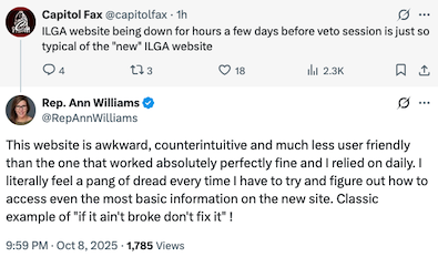
“if it ain’t broke don’t fix it”
Easy to say until the one guy maintaining the legacy system retires and no one else knows how to keep it running.
- Jon Walters - Thursday, Oct 9, 25 @ 10:47 am:
Can you please put together one of your polls so maybe that can register like witness slips do?
- Space Cowboy - Thursday, Oct 9, 25 @ 10:48 am:
As a frequent user of the compiled statutes and various older records, I still struggle to navigate the new website. I thought it’d get easier after a few months, but I still always seems to end up in the wrong place and have to backtrack.
I assumed it was a “me” problem, but it seems like I am far from alone…
- 21st State - Thursday, Oct 9, 25 @ 10:50 am:
definitely harder to teach my Legislative Drafting & Gov’t Affairs class to these law students!
- Frida's Boss - Thursday, Oct 9, 25 @ 11:03 am:
It does look better.
That said making something prettier but less functional isn’t a good thing.
Why you couldn’t keep the same functionality and ease of the old site while dressing it up to look more modern is beyond me?
Agree with the comment it is not easy to navigate on your phone, which is how most of the Dome functions while in session.
- Leatherneck - Thursday, Oct 9, 25 @ 11:19 am:
Bring back the trusty old GA site, it was functional and easy to use ever since that design debuted in early 2003.
Hopefully we find out the staff members who thought that changing something that’s worked well since 2003 to something that is lousy to work with was a great idea. It would not surprise me if some of those staffers pushing for the change were even born in early 2003, or at the very least had started school by then.
- Rich Miller - Thursday, Oct 9, 25 @ 11:28 am:
===Bring back the trusty old GA site===
They can’t because of issues with functionality and compatibility.
However, they should’ve updated that part and left the overall experience alone.
The site is awful. And it’s down way too often.
One or both chambers needs to hold a hearing and drag LIS in to testify.
- Moe Berg - Thursday, Oct 9, 25 @ 11:51 am:
Cory Doctorow’s term “ens–tification” is relevant to the new GA website.
While he’s focused on the decay of commercial platforms, as a broad term it applies for describing something that worked well and served its purpose before being sacrificed for the sake of another goal, in this case aesthetic (though I’d dispute that a huge picture of the Capitol that takes up a strangely vast amount of homepage real estate is a particularly stunning visual).
- Dpiman - Thursday, Oct 9, 25 @ 11:54 am:
Most of the sites I have used previously working for the state of Illinois are poorly designed.
- Leslie K - Thursday, Oct 9, 25 @ 1:12 pm:
==Easy to say until the one guy maintaining the legacy system retires and no one else knows how to keep it running.==
True, but I doubt any of the old site was using COBOL or something. As Rich said, update functionality/compatability issues and leave the experience alone. When I’m facing an urgent deadline etc., I really don’t care if it’s pretty. I need access to the information I need.
As many of us have, I’ve done a lot of research over the years on other state’s legislative websites, and I was always impressed with how easy ILGA’s was to use. Now I’m just grateful that I’m not currently a daily user of ilga.gov.
- Ferris Bueller - Thursday, Oct 9, 25 @ 2:10 pm:
I thought I was the only one who hated it. Good to find some company. Reading statutes on there is very awkward (they’re laid out very badly). Finding old Bills and Public Acts is very difficult. I use the ILGA website on a daily basis and it’s such a struggle.
- Mr K - Thursday, Oct 9, 25 @ 2:25 pm:
How about zero in on DoIT?
They’re all in on Adode Experience Manager sites for every single agency — except those agencies that have web developers.
Those state web dev are usually really, really good.
AEM is anything but.
- Rich Miller - Thursday, Oct 9, 25 @ 2:34 pm:
===How about zero in on DoIT?===
That’s the executive branch.
- Jeremy Rosen - Thursday, Oct 9, 25 @ 3:23 pm:
To Moe Berg’s point if I’m using the site I’m either in the Capitol at that moment or someone who likely knows what it looks like. The huge photo of it feels unnecessary!
- Copy desk has a question - Thursday, Oct 9, 25 @ 5:14 pm:
– One or both chambers needs to hold a hearing and drag LIS in to testify. –
And where do you think notice of this hearing would be posted?
- ChicagoBars - Thursday, Oct 9, 25 @ 5:16 pm:
The new ILGA website is awful, and I gave it a few months before saying it publicly.
Somebody run a resolution telling LIS to go back to the old interface.